More scrutiny than ever is in place on the tech industry, and while high-profile cases like Mark Zuckerberg’s appearance in front of lawmakers garner headlines, there are subtler forces at work. This study from a Norway watchdog group eloquently and painstakingly describes the ways that companies like Facebook and Google push their users towards making choices that negatively affect their own privacy.
It was spurred, like many other new inquiries, by Europe’s GDPR, which has caused no small amount of consternation among companies for whom collecting and leveraging user data is their main source of income.
The report (PDF) goes into detail on exactly how these companies create an illusion of control over your data while simultaneously nudging you towards making choices that limit that control.
Although the companies and their products will be quick to point out that they are in compliance with the requirements of the GDPR, there are still plenty of ways in which they can be consumer-unfriendly.
In going through a set of privacy popups put out in May by Facebook, Google, and Microsoft, the researchers found that the first two especially feature “dark patterns, techniques and features of interface design mean to manipulate users…used to nudge users towards privacy intrusive options.”

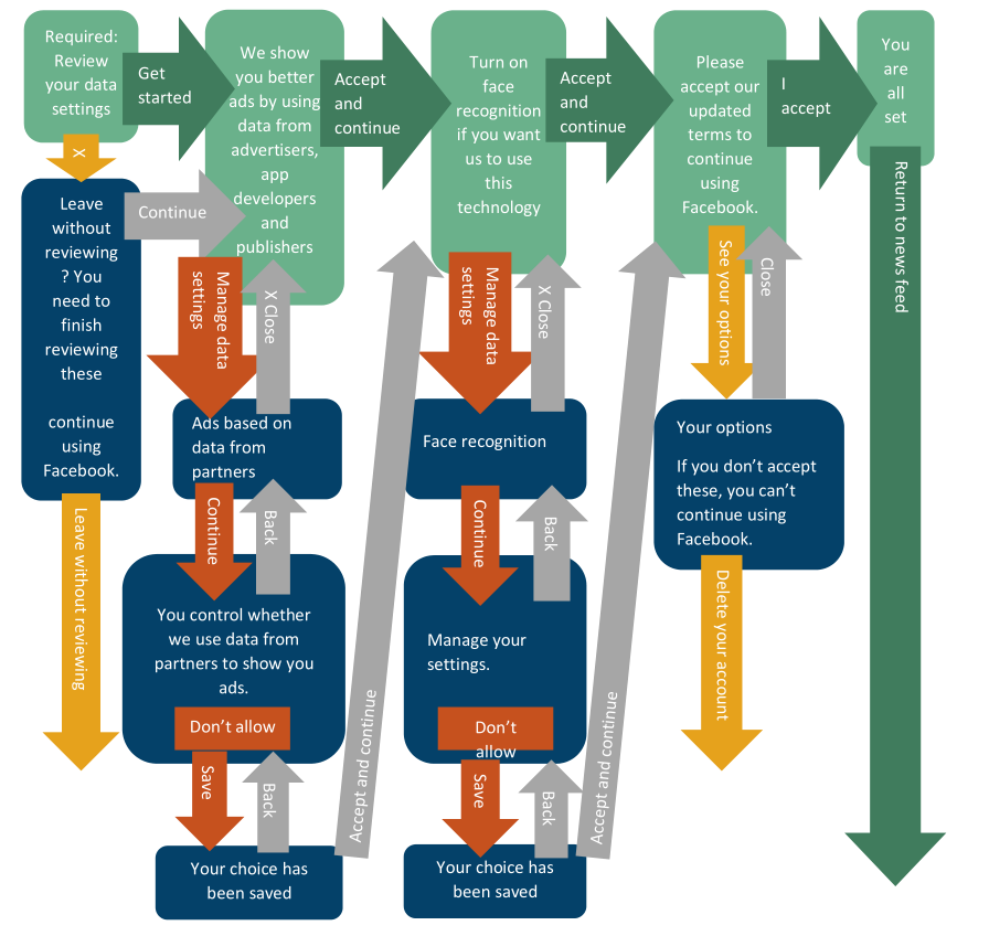
Flowchart illustrating the Facebook privacy options process – the green boxes are the “easy” route.
It’s not big obvious things — in fact, that’s the point of these “dark patterns”: that they are small and subtle yet effective ways of guiding people towards the outcome preferred by the designers.
For instance, in Facebook and Google’s privacy settings process, the more private options are simply disabled by default, and users not paying close attention will not know that there was a choice to begin with. You’re always opting out of things, not in. To enable these options is also a considerably longer process: 13 clicks or taps versus 4 in Facebook’s case.
That’s especially troubling when the companies are also forcing this action to take place at a time of their choosing, not yours. And Facebook added a cherry on top, almost literally, with the fake red dots that appeared behind the privacy popup, suggesting users had messages and notifications waiting for them even if that wasn’t the case.
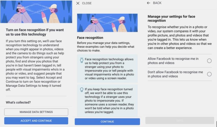
When choosing the privacy-enhancing option, such as disabling face recognition, users are presented with a tailored set of consequences: “we won’t be able to use this technology if a stranger uses your photo to impersonate you,” for instance, to scare the user into enabling it. But nothing is said about what you will be opting into, such as how your likeness could be used in ad targeting or automatically matched to photos taken by others.
Disabling ad targeting on Google, meanwhile, warns you that you will not be able to mute some ads going forward. People who don’t understand the mechanism of muting being referred to here will be scared of the possibility — what if an ad pops up at work or during a show and I can’t mute it? So they agree to share their data.

Before you make a choice, you have to hear Facebook’s case.
In this way users are punished for choosing privacy over sharing, and are always presented only with a carefully curated set of pros and cons intended to cue the user to decide in favor of sharing. “You’re in control,” the user is constantly told, though those controls are deliberately designed to undermine what control you do have and exert.
Microsoft, while guilty of the biased phrasing, received much better marks in the report. Its privacy setup process put the less and more private options right next to each other, presenting them as equally valid choices rather than some tedious configuration tool that might break something if you’re not careful. Subtle cues do push users towards sharing more data or enabling voice recognition, but users aren’t punished or deceived the way they are elsewhere.
You may already have been aware of some of these tactics, as I was, but it makes for interesting reading nevertheless. We tend to discount these things when it’s just one screen here or there, but seeing them all together along with a calm explanation of why they are the way they are makes it rather obvious that there’s something insidious at play here.
source https://techcrunch.com/2018/06/27/study-calls-out-dark-patterns-in-facebook-and-google-that-push-users-towards-less-privacy/
No comments:
Post a Comment