You’re tracking the big stuff.
The ‘macro conversions’ like form submissions, phone calls, and product purchases.
But lying in between those are micro-conversions, the critical yet ‘under the radar’ site actions that ultimately drive success.
When done right, they can accelerate purchases by helping consumers over each potential hesitation or objection (before they arise).
But when you get them wrong, they can self sabotage your efforts by erecting a big, giant, conversion roadblock between consumers and their end goal.
Here’s what they are, how to find them, and how to make sure they aren’t sinking your sales.
Why You Should Stop Obsessing About Conversion Rates
Conversion rates are easy to see.
The Goals inside Google Analytics each time someone purchases, opts-in, or takes a concrete action.
Because they’re easy to see, to spot, and set up, they’re also easy to measure.
It’s Digital Marketing 101. Takes three to five minutes. And pretty soon you’ll start seeing that number move in the right direction.
There’s only one problem though.
Conversion rates aren’t wrong per se. They’re important. But they can be misleading, too.
Conversion rates, by themselves, aren’t actionable. And they only account for a very small slice of the interactions that happen on your website. So only ~2-10% are doing it.
Optimizing the hell out of that 2% to move it higher to 10% is fine. Until that high conversion rate backfires.
It was artificially pumped up; like your favorite roided-out bros at the gym, taking #swellfies while pumping out bicep curls. All the while, they’re wearing pants to cover up those skinny, wimpy legs that would snap under their top-heavy torso if they attempted to play any sport.

What were we talking about again? Oh yeah, conversions.
Issue #2:
Focusing 100% of your time on 2% of your site visitors… doesn’t make a whole lotta sense when you think about it. Sure, a tiny bump in that conversion rate could mean serious revenue.
But it’s the end of a process. Not the beginning. There’s a bunch of little stuff that happens before people even get to that final destination.
Which brings us to Avanish, the Amazing Analytics Avenger.
He recommends you focus on “Task Completion Rate by Primary Purpose” instead of obsessing over conversion rates.
Um, what?
Essentially, that means solving for why people visited your site in the first place.
Basically, people come to your site for a whole variety of reasons. It could be to purchase, sure. But that’s only the tiny majority. Everyone else is visiting in order to learn something, find something, or do something.
Maybe they found your blog post on Twitter and wanted to read a few more. Or perhaps they’ve been to your site once or twice and wanted to check out how your services work.
The “Task Completion Rate” thing attempts to determine if people were actually successful (or not) in quickly, easily, painlessly, finding that stuff.
It’s fundamentally better for customers because it should result in a better website experience. And it should be better for your team because it gives you actionable elements to fix or change or track.
Before we get to those individual details though, you need to figure out which paths people are already taking through your site. The actions or tasks they’re trying to accomplish. And then zero-in on those ‘user flows’ first.
What is User Flow Optimization?
A user flow (or ‘user journey’) is “the path a user follows through your website interface to complete a task (make a reservation, purchase a product, subscribe to something)” according to Peep @ ConversionXL.
Ecommerce checkout flows or funnels are the easiest to see for most. But they also apply to a ‘user journey’ that doesn’t end in a hard conversion, too.
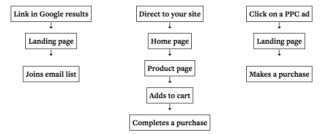
For example, you could have someone from a PPC campaign go directly to a landing page and then an opt-in or purchase page.
But you can also have people from Facebook go to a blog post. Or brand-aware people typing in the homepage and then going directly to your Services and About Us pages.
Each is a separate journey. With a different beginning and end. With a different intent.
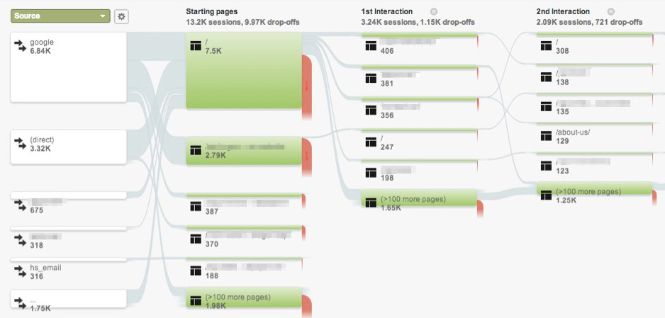
Google Analytics even has a helpful little report, appropriately called ‘User Flow’ (under Behavior). It will show you the (1) source people are using to find your site, the (2) very first page they land on, and (3) the subsequent pages they visit afterwards.
It’s not perfect. There are flaws. But it’s a start. You can start seeing those patterns, like organic search traffic going directly to your homepage. Which then lets you draw a few assumptions (like most of those visitors are ‘brand-aware’ because they’re probably Googling brand names to hit the homepage).
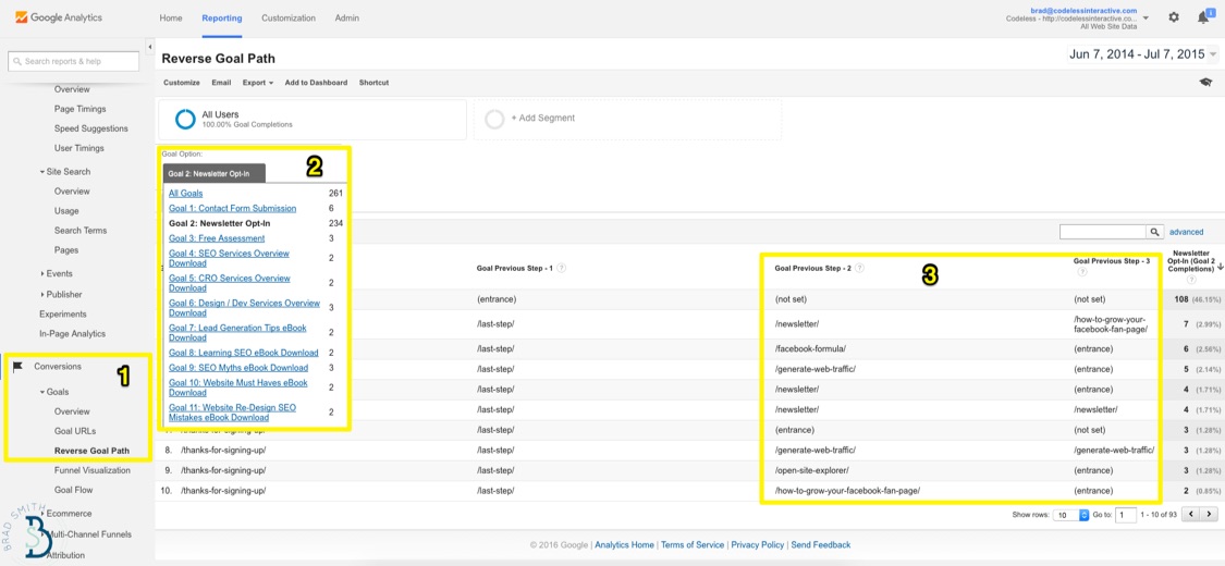
The Reverse Goal Path under Conversions is another helpful report. True, it focuses on those hard, ‘macro’ conversions we were just warning against. But you can also back the truck up a little bit and see which pages were hit before the conversion took place.
You’re looking for the pages that assist conversions. The ones that grease the wheels and make them happen.
If you have the full gamut of TOFU, MOFU, and BOFU offers setup, it’s also helpful to line all of these micro-conversions up to see the transitions from one to the next.
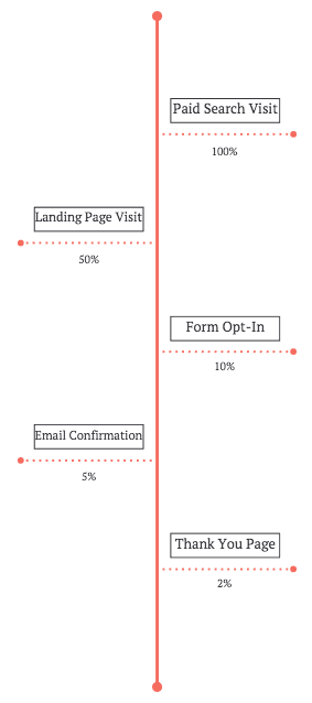
After doing this, you can start to look for those conversion rates at each little step to quickly figure out where ‘conversion bottlenecks’ are undermining your efforts.
Here’s a classic scenario.
Conversions are “too low” says boss or client. Ok… but things actually don’t look to bad. It’s right in line with ~2% eCommerce conversion rates or ~7% for B2B services. Sure, it could be better. But it’s not terrible.
Instead, you see that the rate of people viewing the product page and adding it to their cart is low. (Or viewing the Product/Service page and scheduling a demo.)
So. Your attention then switches to the ‘beginning’ of the user journey. How many people that are looking at the initial Features page are clicking through to either (a) learn more about the product or (b) schedule a demo?
Ok, perfect.
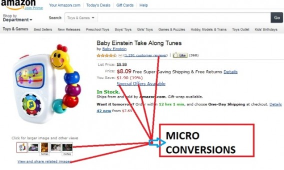
Now, how many are completing the ‘micro-conversions’ on each product page (that ultimately lead a greater percentage of them into your check-out or opt-in flow)?
Those commonly include customer reviews, photos, discounted pricing or special offers.
The best part about these ‘micro-conversions’ is that you can test them.
For example, just including a video on a landing page can lift conversions 80%.
So… do that! Then create a Funnel Report to compare conversion rates for those that watch the video against those that don’t watch it.
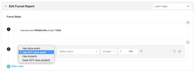
The best part is that these micro-conversions (+ funnel reports) can even arm you with more ammunition to go back to your boss or client.
For example, find the conversion rate impact from testing different micro-conversions first. Say, one video for one product.
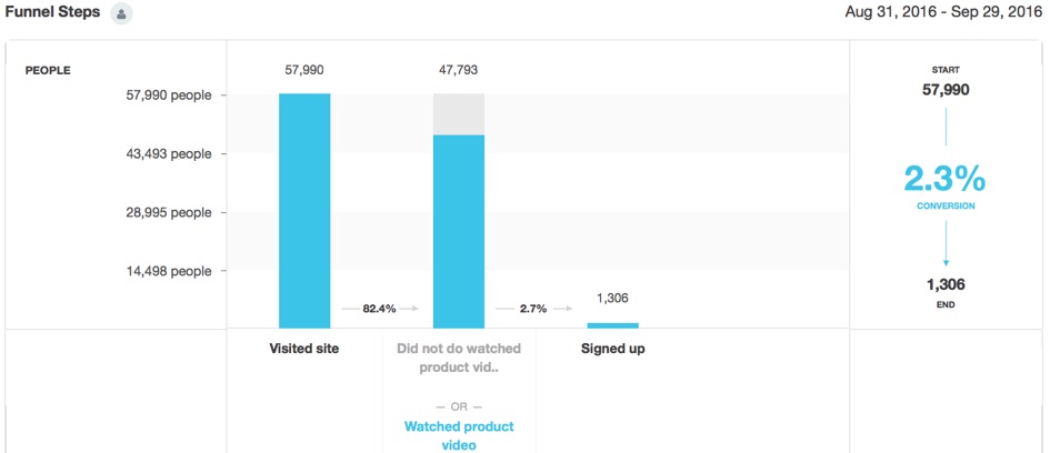
Good. Now let’s apply that change in conversion rate. Let’s say an extra 1%, which is high, but it keeps the math simple.
- 10,000 customers
- $100 average value
- 2% with video views (vs. 1% with normal)
- Extra revenue with video view: $10,000 ($20,000 – $10,000)
That’s kinda wishful thinking. But you get the idea. That extra revenue lift, applied across all products, should give you a theoretical budget to play with in producing more videos, images, etc.
Now. Let’s see how this plays out in real life with an example.
Bonobos Example: How Micro Conversions Impact Conversion Rates
Bonobos is a low priced yet fashionable online retailer.
They’re about to be acquired by WalMart for a reported $300 million. So, not bad, considering they were founded in only 2007.
Their branding is good. Products are good. UX is good.
Conversion flow? Not so much.
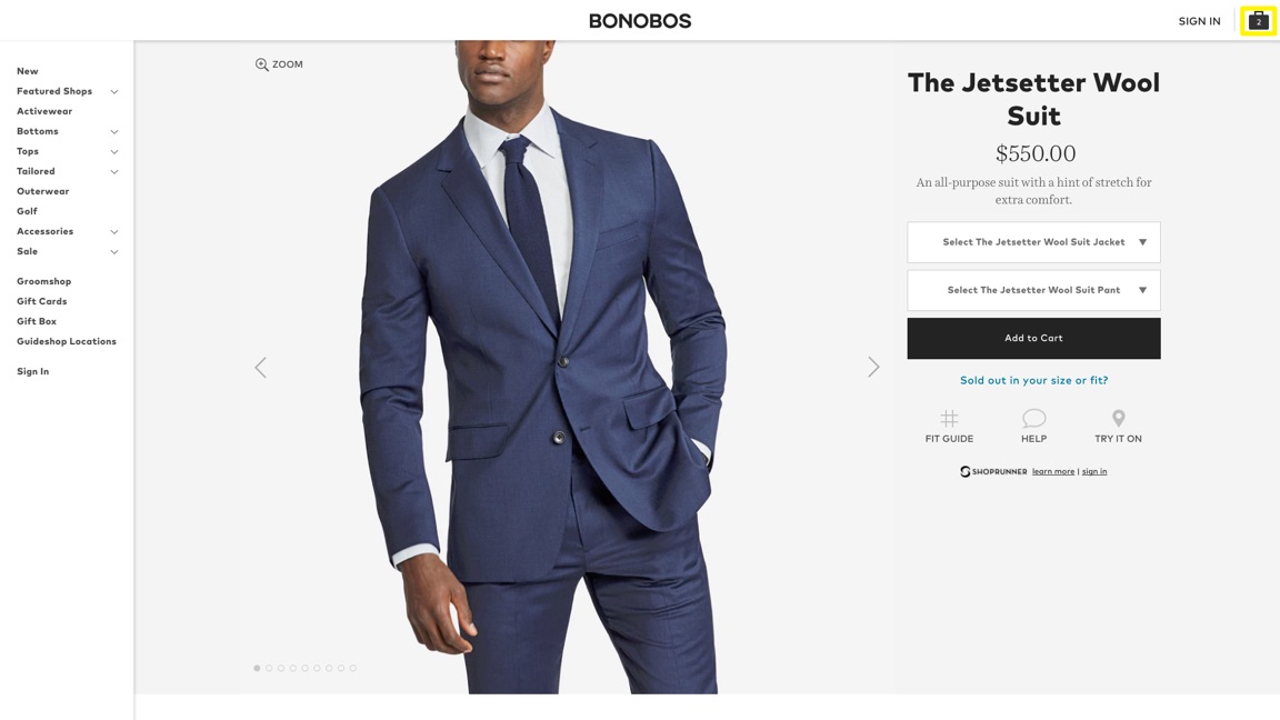
Things start out fine. You add a few products to your cart. And continue browsing. The first potential issue is that in an effort to stay true to a minimalist, elegant UX, they completely downplay that you even have anything in your cart in the first place.
Not great, but not terrible, either. Unfortunately though, this is…
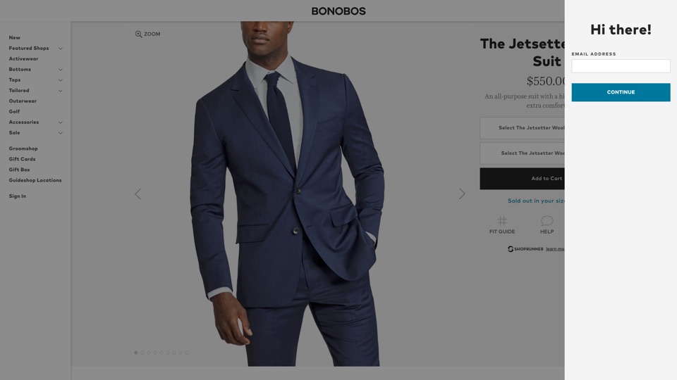
You want to checkout and buy the products. Or at least see how much they end up being with taxes, fees, etc. So you click on Checkout and see:
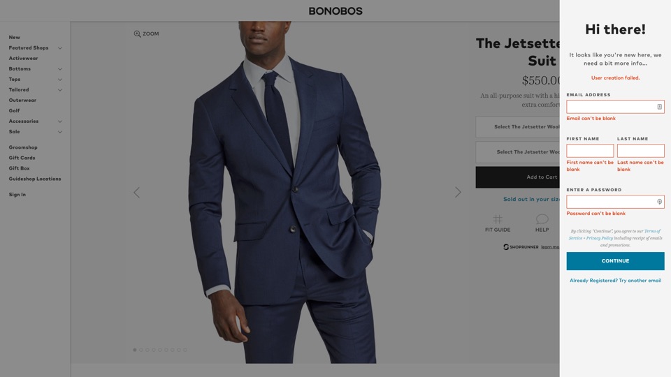
Ok. Strange. You’re trying to checkout and the next screen is a generic “Hi there!”, asking for your email address.
So you do what any sane, rational person in this scenario would do: you try to keep hitting Continue to bypass this step.
Problem is, they don’t let you go any further without creating an account.
Ok. Time for some stats to illustrate this potential pitfall.
Shopping cart abandonment hovers around ~70%. That’s terribly high.
One of the primary reasons people abandon carts? “Did not want to create an account with the merchant.”
Usability expert Christian Holt pegged that number at 30% who abandon because they’re asked to register upfront. Another study found that removing the required account creation helped boost sales for one retailer by $300 million.
(Or the same price being floated for the Bonobos acquisition.)
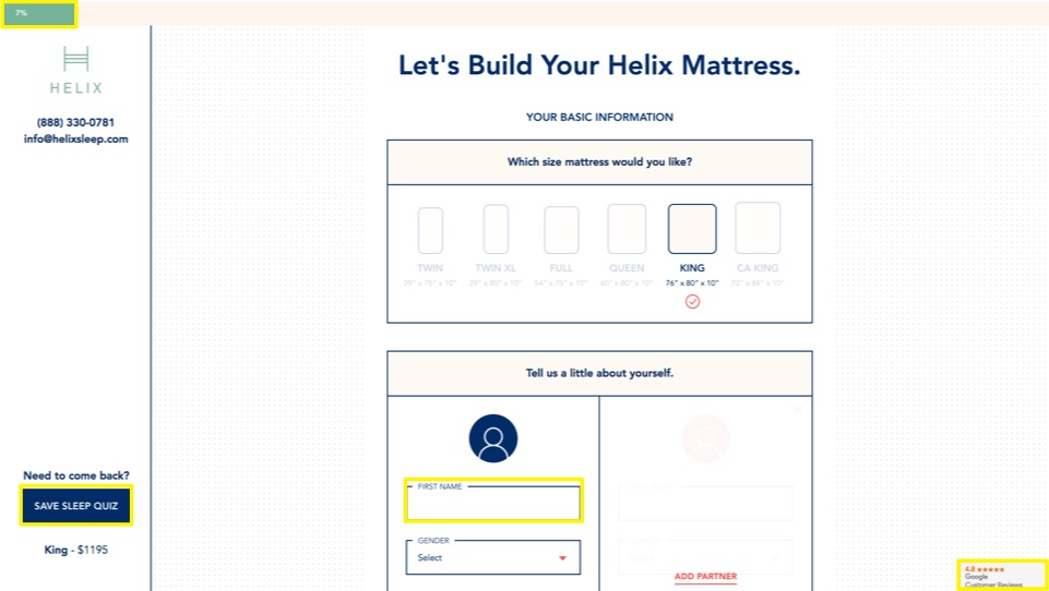
Now compare that to an excellent checkout flow from mattress company Helix.
- Progress Bar: 75% of people want this usability feature.
- Save Progress: For the 24% who prefer to save and come back later.
- Consumer Reviews: Subtly supporting the 90% of people that believe peer reviews over branded messages.
Same end goal: ecommerce checkouts. But a greater focus on the micro conversions that add up to the ultimate macro-one.
Conclusion
Your overall, site wide conversion rate leads to sales. Sure.
But it’s the output, or the result of many little things that came before it.
Micro-conversions occur at every single step from when someone hits your site. Those ‘user flows’ are critical to eventually, one day, turning into paying customers (assuming they had a good experience, first).
Then once they do come back, micro-conversions could mean the difference between a larger number of visitors turning into customers because of video views, progress bars, and more.
Or it could mean the difference between a greater of number people abandoning your checkout process because you don’t allow guest checkouts.
The only way to know for sure, is to switch your focus away from conversion rates (initially) and instead spend more time helping customers complete the “task” that brought them to your site in the first place.
About the Author: Brad Smith the founder of Codeless, a B2B content creation company. Frequent contributor to Kissmetrics, Unbounce, WordStream, AdEspresso, Search Engine Journal, Autopilot, and more.
No comments:
Post a Comment