Your problem isn’t what you think it is.
More traffic can definitely paper over some cracks. Likewise, more downloads, installs, or sign-ups always help.
But that’s not it.
That’s not the thing holding you back.
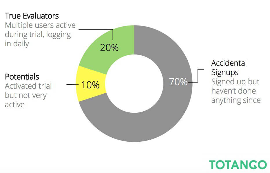
Because if 70% of free trials are useless (as reported by one study we’ll get to in a second)… more traffic or signups isn’t gonna help you. Pouring more water into a leaky funnel will won’t help you fill it any faster.
Instead, you gotta turn your attention to fixing those holes, first.
Specifically, starting with how to get more people successfully Activated and engaged to stick around for the long haul.
Here’s how to do it.
Revisiting The Top of the Funnel Fallacy
Less friction generally means higher conversion rates.
Example: Go from eleven down to four form fields and conversions shoot up 120%.
Pat yourself on the back. Fire off a blog post to GrowthHackers.com and call it a day. Plenty of artisanal stout beers to go ‘round.
But here’s the thing.
More isn’t always better. Over-optimizing conversion rates – taking drastic actions to boost one isolated number – don’t always pan out in the long run.
Just ask Moz, who found out that, “Many, many [website visits] visits are often correlated with high purchase prices.”
In other words, the most profitable customers didn’t convert after a single session or two. In fact, those that did were more likely to churn and bounce the quickest as well.
Instead, the most profitable customers often visited the website at least eight times prior to signing up for a free trial.
Totango ran a study years ago that illustrated a similar point. Their data showed that you’ll see a higher conversion rate (~10%) without asking for a credit card during sign up then you will when you do (~2%).
But that doesn’t matter. Because they don’t stick around long enough to mean anything.
Only around 20% of those trials are actively evaluating the product and considering crossing your finish line. (While as much as 70% are completely useless.)
A similar study looked at how customer conversion rates changed when a credit card was required upon sign up. The results showed that as many as 50% of people who used theirs during the initial signup will convert. While only around 15% who didn’t use their credit card will go on to become a customer.
TL;DR?
Over-optimizing the top of the funnel is pointless if it doesn’t result in more bottom of the funnel customers. Otherwise, you’ll stand to gain more from focusing on the middle of the funnel. Because: loyalty economics.
Here’s where to start.
The Three Components of a Successful ‘Activation’
The middle of the funnel never received a ton of love before Dave.
Sure, self-proclaimed ‘social media gurus’ loved to ramble on and on and on about this “engagement” thing. But they never bothered to stop and actually explain what it meant or how to prove it. Probably too many campfires to croon kumbaya around.
But then in stormed Dave, with his TV-MA, profanity-laced, multi-colored, seizure-inducing blog posts that undoubtedly crippled at least one poor epileptic.
His startup metrics presented a simple framework that connected the dots from Acquisition to Revenue.
This clever device practically made Activation and Retention household names for geeky growth hackers who didn’t quite yet have growth hacking to growth hack about growth hacking.
The Activation piece specifically focused on that all-important, yet least understood part of the funnel: delivering a ‘happy’ first experience so that people stuck around and came back to the site.
This is the ‘engagement’ part. It didn’t just mean signups. But a host of other behavior-based metrics like the number of pages people viewed prior to signup. The number of visits and the time on site. And the number of features used.
Fraser Deans, co-founder of Nickelled, breaks down Activation into three separate buckets in an excellent Medium post. (Also, he gets a +1 for squeezing “bloody brilliant” into the title).
Those three are:
- Phase One: Pre-Signup: Messaging that ‘primes’. It introduces, teases, and prepares someone to take a successful action.
- Phase Two: First User Experience: The ‘mission critical’ steps to take that deliver utility.
- Phase Three: Post-Signup: The follow-on activities to ‘seal the deal’.
Simple and easy to understand. A good a place as any to start.
Phase One: Pre-Signup
1. Begin at the Beginning
As in, the place where peeps are coming from. Because it can tell you a lot about who they are, what they’re looking for, and how to best ‘prime’ them for a successful Activation.
For example, look up your business in Google’s Customer Journey to Online Purchase to understand when people use certain channels.
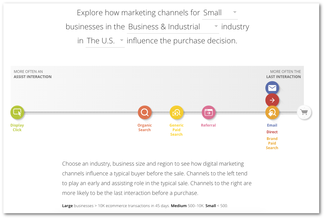
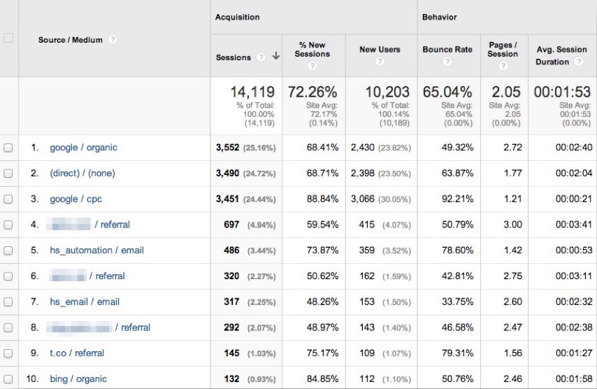
Great. Now pull up your analytics and check out current traffic over the past 30 days to six months. Where are they coming from?
Perfect. The majority of site visitors here are coming to the site directly or through Search (both Organic and Paid). That means a lot of ‘branded’ traffic.
Here’s why that’s important.
2. Find Out What that Traffic is Looking For
Someone’s ‘path’ through your website can tell you a lot about where they are in the funnel.
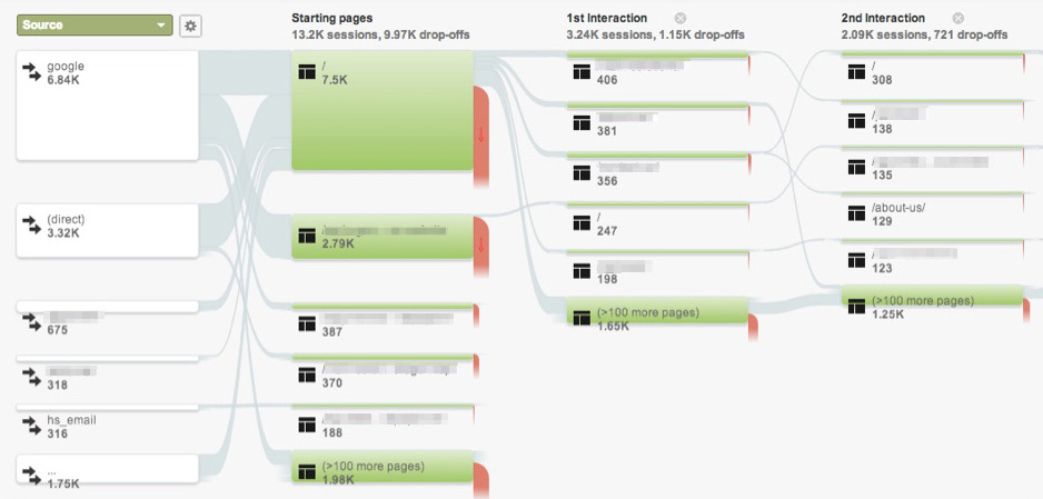
One way to spot this is the User Flow report inside Google Analytics. It’s not perfect, but it allows you to view which pages people are going to by the original Source.
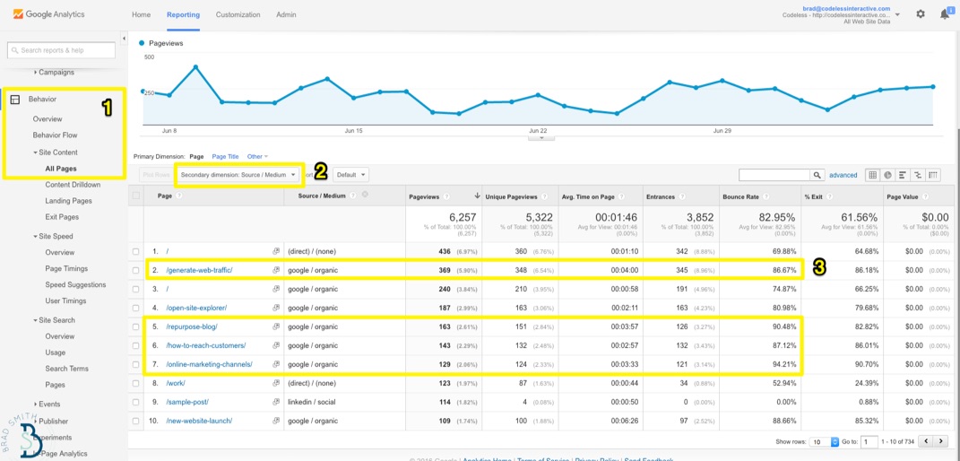
Another way to look at this is by going to your most popular content and adding a secondary dimension based on the Source / Medium.
Isolating each Source and its destination helps you connect the dots. It helps you spot different segments and funnels. For example, that Social brings in new people to blog posts while those that click on a Branded Paid Ad already know all about you.
Then you can improve upon it.
3. Optimize these Funnels
Most companies obsess over the home page. Or they obsess over the latest blog posts from the past month.
But when you go through those first two steps, you’ll quickly notice that neither are among the most popular ‘paths’ through your site.
Instead, here are some from ConversionXL to look for:
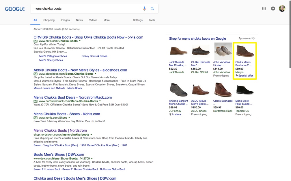
At each step you want to streamline/optimize/improve how people go from one to the other. Often that includes ‘priming’, which means getting your message match spot on, too. Here’s how it plays out with an easy eCommerce example.
Someone looks for a specific product in Google. Maybe it’s “mens chukka boots.” They see and click on the Special Offer.
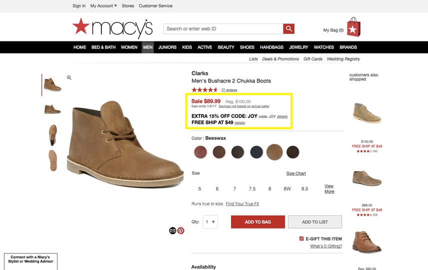
Which sends them to a product page (because they clicked on a the shopping ad) that features language referencing not only the product but also the Special Offer that was alluded to.
Got it? Good.
Phase Two. First User Experience
4. Outline ‘Success Milestones’
Now you got ‘em. The trick is to keep them around.
First, start by outlining those “customer centric success milestones.” These are the steps that people take which should equal a ‘happy first experience.’
Often that means the user takes action. They upload something. Add in some details. Or connect some accounts.
For example, Lincoln outlines creating an online store. Which makes my life easy, because now I don’t need to think up an example. ;)
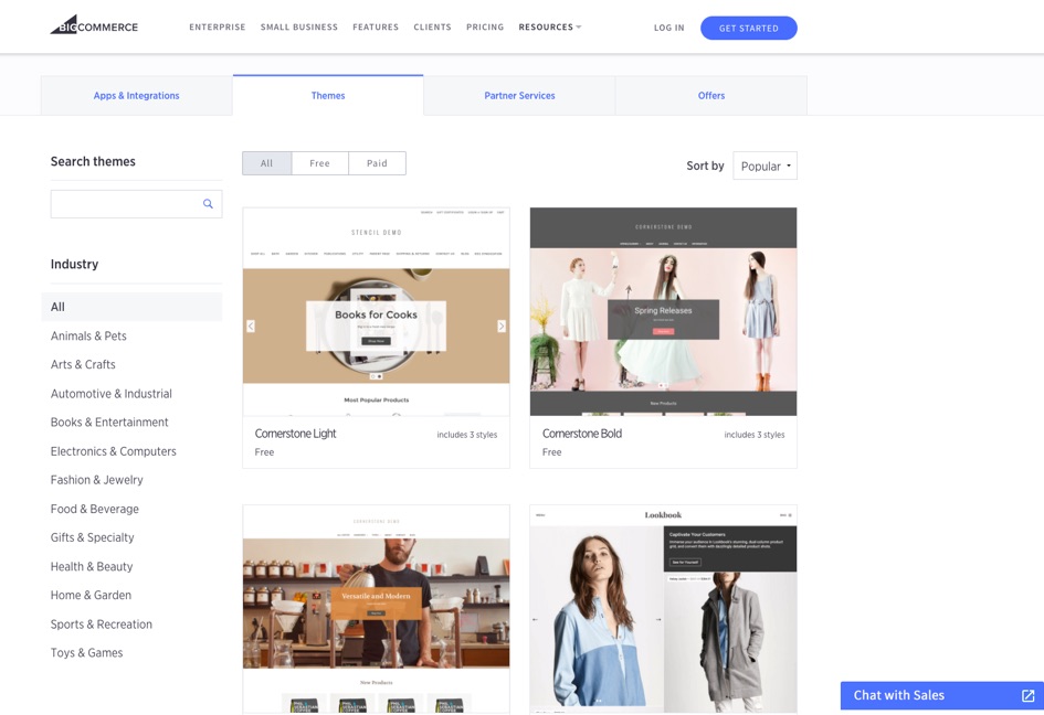
So if I’m BigCommerce, maybe that starts with first helping people pick an eCommerce theme. That’s critical before anything else, because first impressions are design-driven.
Onboarding starts there…
… before going to the other boring (albeit important) stuff like determining a URL, setting up payment gateways, worrying about taxes or shipping, etc.
5. Instrument Each Success Milestone
Now instrument these steps along the way so you can measure, iterate, and improve. (Using, oh, I dunno, Kissmetrics perhaps.)
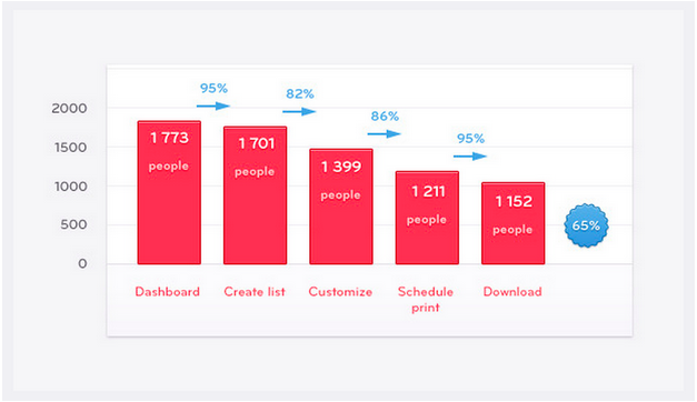
For example, here’s what those individual milestones look like for Patrick McKenzie’s Bingo Card Creator:
Each step is concrete so you can measure which activities (or transitions) lead to the greatest drop offs.
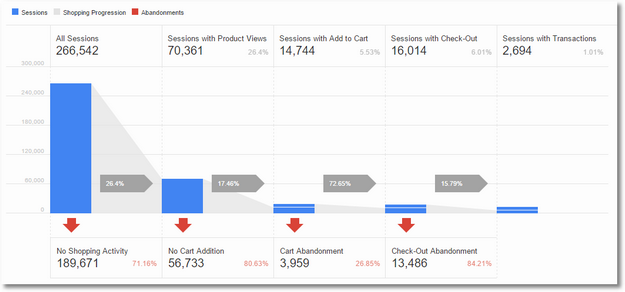
Here’s an eCommerce example using the Shopping Analysis from Google Analytics.
Different use case, same steps (or more or less).
Instrumenting these events gives you the ability to zero-in on where people are leaking outside your funnel. Here’s how to fix it.
6. Test Biggest Drop-offs First
Revisiting our online store example from a second ago, let’s say a major dropoff occurs on that initial “Pick Theme Design” step.
People are signing up but not, for whatever reason, moving past all the options they face. Maybe there’s too many options. More options = more complexity = less conversions in some cases.
Ok. So let’s simplify instead.
Where are those visitors coming from initially?
Let’s pass some referral data through the signup process. That way you can immediately show Fashion-related themes to those who just Google “Fashion online stores.” And apply that strategy across the board to increase the rate of users successfully completing that micro-step in your funnel.
Buffer, for example, found simplifying the onboarding process was key to their Activation, too.
Leo Widrich told Chargify that they found success in restraint. Instead of trying to make users actually share something (which is the entire purpose of their product), they instead just wanted them to connect their social accounts, setup timezones, and optimize posting times.
“So we rebuilt our onboarding process to focus on those items first and not push sharing and all other features instead. It made a huge difference in our activation!”
Phase Three: Post-Signup
7. Systematically Move People from A -> B
You’ve iterated on each Success Milestone now. Ran a few tests and know where the problem areas lie.
The next step is to make sure as many people as possible are attempting to complete each. And sometimes they require a little gentle prodding along the way.
This is classic marketing automation, where you’re automatically following up with people about completing the ‘next step’, until… you know… they complete the next step.
No need to overcomplicate this. See: 451% new qualified leads and 34% increase in sales.
So take your pick. HubSpot can do it. And the yet-to-be-release Kissmetrics Campaigns will be able to fire off emails based on certain conditions (e.g. signed up but no login) Stay tuned for the release. Same process (key word there) no matter which tactic we’re talkin’.
The trick is to ‘systemize’ follow-up at each step or milestone. Often in multiple channels.


No comments:
Post a Comment