Paid search is often the biggest driver of new customers.
Largely because people are typing in exactly what they’re looking for.
But.
These aren’t necessarily the most profitable customers you’ve got. Especially not in the beginning.
Your repeat ones are.
‘Retention’ is often associated with ninja-like email growth hacks. But it’s much more than that.
Proper ‘retention’ and onboarding starts the minute someone sets foot on your site, and their interaction can influence the rest of their experience over the next few hours, days, or weeks.
Here’s how.
How “Loyalty Economics” Works
Everyone says that repeat customers are more profitable than new ones.
Supposedly some book, Marketing Metrics, says that repeat customers have a 60-70% chance of converting.
At least, that’s what every blog post says when you Google ‘repeat customer vs. new customer‘ (I personally haven’t read it).
But what about a real study?
Waaaaaaay back in 1990, while most startup founders were still in diapers, Bain & Company partnered with Harvard Business School (ever heard of ‘em?) to analyze the, “costs and revenues derived from serving customers over their entire purchasing life cycle”.
When you translate that from Academia to English, you get, “how much repeat customers are worth vs. new ones”.
Originally published in a F-ing paper magazine, the study was groundbreaking in that it finally declared that “increasing customer retention rates by 5% increases profits by 25% to 95%”.
Basically it showed, empirically, that new customers are often unprofitable for the first few years based on high costs of acquisition (both hard and soft), and it’s only later with repeat ones do they become profitable.
A decade later (so we’re still talking back in 2000 at this point), Harvard revisited the study to now include online purchases. Not only did those same ‘loyalty economics’ patterns show up, but the differences were also “greatly exaggerated online”.
For example, companies only online (as opposed to both online and brick and mortar) usually had to spend 20-40% more on new customer acquisition.
These studies gave widespread notoriety to ‘retention marketing’, as a theory, and in practice, that shows up almost everywhere online today.
And it’s important to note that we aren’t just some trendy, hipster, mobile SaaS apps either. But all industries.
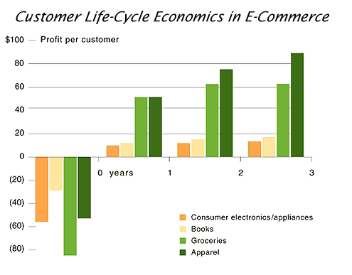
For example, online grocers typically had to retain customers for 18 months to break-even after a $80 customer acquisition cost.
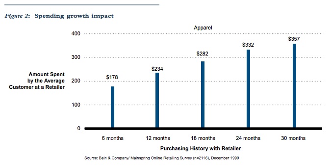
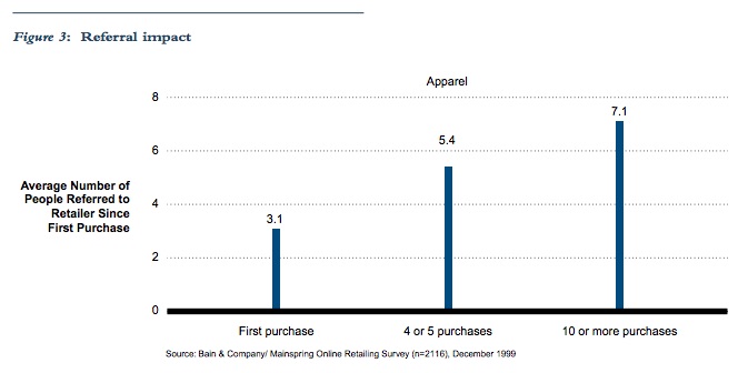
Bain looked at many different retailers, from consumer electronics to apparel and appliances, finding the same exact patterns pop up.
Not only were repeat customers worth more than new ones, but that repeat ones also were more likely to refer you to new customers (thereby dragging down your cost of acquisition on those new people as well).
Former eBay CEO, Meg Whitman, said at the time that, “more than half of its customers are referrals”. And that because word of mouth was so much, they “spent less than $10 to acquire a customer”.
Fast forward to today, and the same exact trends emerge.
Adobe found that repeat customers are 9x more likely to convert (compared to new customers who haven’t purchase prior).
And Sweet Tooth Rewards found that a repeat customers have a 54% chance of purchasing again (compared with a 27% chance of new customers).
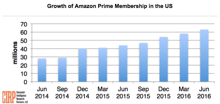
Or, ask Amazon.
Prime members will spend $75 billion this year alone.
On average each year, they spend about $1,200 compared with around $500 for non-Prime members.
Now that we’ve beat the issue to death, here’s the rub:
If repeat customers are worth more, less price sensitive, and more often to refer than new customers…
… Why do we spend 12% of marketing budgets on retention?
(And probably less of our attention?)
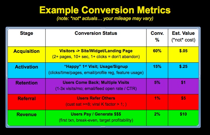
1. Define Success Milestones
Before Dave McClure was an uber-accelerator extraordinaire, he wrote incredibly insightful, humorlessly punctuated and often NSFW blog posts.
One of these clever, punchy posts quickly morphed into startup metrics; becoming a simple analytical framework alternative to the ever-increasing complex dashboards found in most startups today.
The premise was simple: pick a few key metrics for each funnel stage to illustrate when it’s been met.
One specifically, Activation, focused on making sure people had a “happy-first experience” that’s required before any retention could happen.
Get ready to literally travel back in time, as this next image is embedded directly from Flickr.
“Activation” is similar to “customer centric success milestones” from Lincoln Murphy, in that you’re shooting for a few key moments when things to start to click for a customer.
For example, in a recent blog post, Lincoln uses an example someone starting an online store and defines a few of the possibilities, such as:
- Creating the store
- Adding logo, designs, etc.
- Setting up a payment gateway
- Creating new products.
- … You get the picture.
The idea is to identify (and eventually instrument) key activities on your site or inside your app that will later be used for forces of good (like follow up), but for now can be signs of success (or problems) that either help (or hurt) people’s customer experience (and thus, your conversions).
For example, the other day I was looking for a hotel. They had a nice suite, and I clicked on ‘show room amenities’ to see exactly what it looked like.
Instead of, oh – I dunno, pictures, video, or diagrams, I was met with this:

A huge wall of text, featuring an overwhelming amount of bullet points that does nothing to (a) communicate their value, but more importantly (b) help a potential customer achieve that ‘happy first experience’ of View Rooms –> Decide to Search Dates.
Those little micro-interactions are critical, because it mimics our unconscious browsing behavior that leads us to say, “Yes! Tell me more…” vs. “Eh, let’s keep looking”.
Design, and more specifically UX, is supposed to guide those interactions; giving customers what they want most while also steering them towards your ultimate business objectives.
For example, if you were to hit the back button (don’t do it now!) or go back to the Kissmetrics product pages, you’ll notice the ‘next steps’ for customers are clearly highlighted, with primary actions featured visually while secondary ones are more subtle.

Providing clear paths through your site (or app) is the first step towards getting a customer generated, or a free trial to become sticky – prior to any retention taking place. And you do that by not making people think.
You can even instrument these ‘customer success milestones’ in your funnel, giving a more nuanced view of actionable steps that you can make better marketing decisions around (like, “Hey – why are all those people dropping off between Cart –> Order?!”)
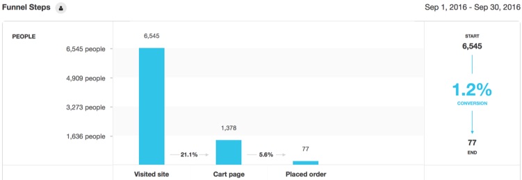
For example, here’s how a typical eCommerce funnel can be set up, where people visit the site, view products, add to cart, start the checkout process, and eventually place order.
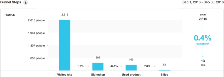
SaaS apps, while different, aren’t really all that different at all. You still have people coming to a site, doing some initial browsing of key pages, signing up for a free trial, actually using the product for a bit before entering their billing info and hitting Upgrade if all looks good.
Now that you’ve got the major steps or milestones outlined, you can begin to dig into the details to uncover gaps inside or out of your product.
2. Map Your Customer Lifecycle
It’s slightly depressing to think that around half of your free trial users will sign up, use it one time, and then never come back again – dropping your app fast like the worst of one night stands.
And while these ‘onboarding’ techniques (or statistics in this case) are often associated with SaaS products, it’s important to realize that it’s no different for how people starting shopping on an eComm site, only to bounce (like 67% of them). Or start punching in their travel dates for a hotel, without ever completing the booking (81% of them).
(It’s also important to note that you can’t do some of the ‘classic onboarding’ stuff like event-based messaging – which we’ll discuss in the third part below – until these first two are sorted out.)
The only saving grace is that you can increase conversions without A/B testing by making changes to how people look for, find, and complete these ‘milestones’ you’ve just identified.
One simple method is to identify friction points as people attempt to navigate the treachery (that is your sitemap) and hit each milestone.
For example, friction points can be at the very start of a customer interaction, when they’re simply trying to find a product to add to cart.
But they’re more commonly in the middle of an interaction, when they’re trying to find specific things but your site is making it impossible.
For example, below is a basic Heatmap analysis showing a service-based site’s portfolio of work.

Notice something missing?
The freaking clicks! It’s a virtual ghost town, with basically ZERO focused clicks and page interactions.
There is a hover animation (that you obviously can’t pick up on an analysis like this), but for whatever reason it’s not doing its job in getting people to click and view the portfolio examples (which is a critical step to them hitting the Contact Us button and reaching out).
Again – these principles apply inside an app as well as outside on the marketing site.
For example: Toggl. Awesome product. Insanely simple time tracking. Even the least technical people enjoy it.
Until, that is, when you’re about to log time against a new project and you need to setup a new client.
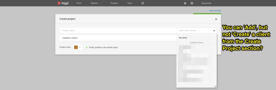
And you see… nothing? You can create a project here, but no Client (even though the label tells you to Add a Client).
(This also reminds me of Google Hangouts. Which you can tell was built by engineers. Because while using the product is great, starting one is another nightmare entirely.)
A path report comes in handy here, allowing you to dig deeper into the customer journey and pinpoint where some problem areas exist.
Segmenting your converters vs. non-converters, and then analyzing differences in their path or journey, is one way to surface these issues.
As an added bonus, path reports can also give you better attribution metrics because they’ll pick up all the stuff that happens during (not just before and after) a complete customer journey. You can track this stuff back to which (and how) your marketing channels (and thus, budget + resources) influence each step.
No comments:
Post a Comment