When you hear the words “site architecture,” the first thing that comes to mind is probably SEO.
It doesn’t take much digging into SEO best practice to learn that Google loves a site with clearly defined architecture that’s easy to crawl and index.
But if you stopped your site architecture planning with just your SEO, then you’ve missed out on the greater picture.
Site architecture isn’t just an effort to game search engines into ranking your site higher.
It does help with SEO, but it’s so much more than that.
Ultimately, your site architecture should be a strategic effort that allows your organic or paid visitors to navigate easily and use your site for its intended purpose.
That means that site architecture is the older brother of conversion rate optimization.
So in this post, I want to show you exactly how site architecture simultaneously supersedes and enables traditional conversion rate optimization efforts.
And to start things off, I want to dig a little deeper into why so many conversion rate optimization efforts fail.
Why conversion rate optimization doesn’t always work
When dialing in your conversion rate optimization, it’s easy to want to focus on the more traditional efforts.
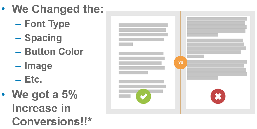
Typical conversion rate optimization efforts require brands to set up competing versions of the same page in order to see how they can improve them.
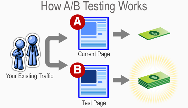
It’s like a battle royale for website pages.
After a week or two of waiting and measuring, the best performing page wins.
One of them stays up, while the others are discarded for all eternity.
From there, more experimentation occurs based on the winning page’s performance to see if anything else can be improved.
Sometimes, brands will even get brave and conduct some multivariate tests to see if changing multiple elements can yield improvement.
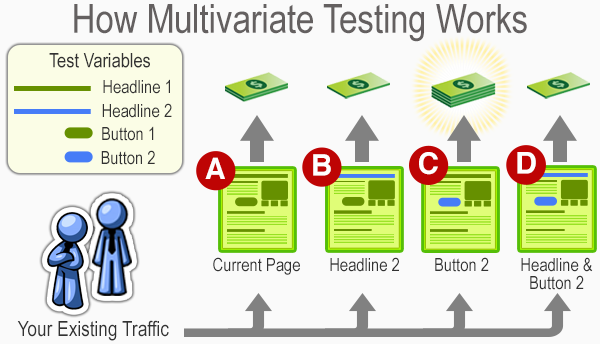
Much like a traditional A/B test, the results hinge on a last-man-standing approach.
Brands can be the loser, and the winner stays up as the subject of more experimentation.
All of this is an ongoing effort to see how you can improve conversions over time.
Many frequently blog about this practice, which even has its own career field in the marketing industry.
But these types of tests aren’t always the most dependable for small brands that need to optimize as efficiently as possible.
And even some large businesses fall prey to common A/B testing mistakes.
For example, elements like sample size can drastically skew the results of conversion rate testing.
Simply put, if you’re not getting enough traffic, then you’ll be making changes and concluding off of insufficient amounts of data.
That means you could be making the wrong moves and ultimately hurting your brand’s performance.
Or you could also be testing something silly, like colors on your website.
To put it in ConversionXL’s Ott Niggulis’ words:
“There is no universal best color. What works on one site, doesn’t necessarily work on another.”
And that’s part of the point as well.
Many conversion rate optimization trends rise on the backs of a brand or two saying they saw good results from a particular experiment.
Then everyone does it, and confusion results when improvement doesn’t follow.
And then to make matters worse, many brands often don’t allow a proper amount of time to see if their results end up sticking.
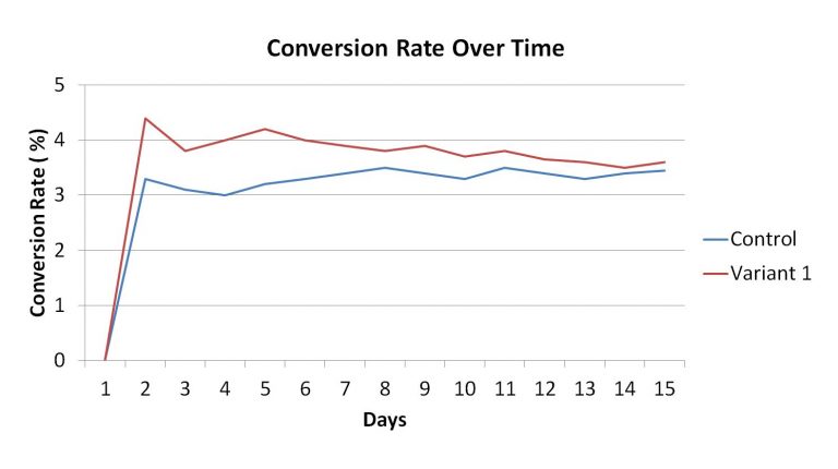
If your variable regresses back to your control’s average, then there’s a good chance that dropping your control could be a bad idea.
Many brands will prematurely make a decision on the first few days, which ultimately hurts them in the long run.
People call this the small win mentality. It ultimately leads to poor optimization and potentially undermines your results.
So with all of the potential pitfalls of traditional conversion rate optimization, can site architecture create a more foolproof way to ensure that your website sees plenty of conversions?
To answer that, I want to break down some of the basics of site architecture and show you how it correlates to your conversion rate optimization.
How site architecture creates conversions
Your site’s architecture focuses on building a platform that is easier for your users to navigate.
When you look into what site architecture actually is, you’ll typically see a graph that offers a genealogy-like depiction of how pages on your site interact.
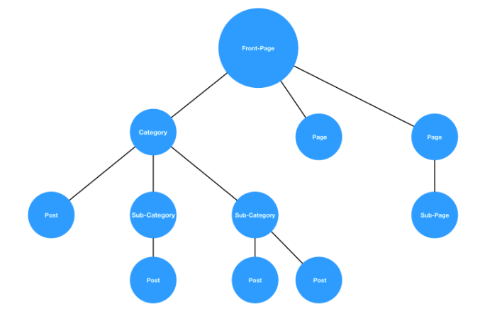
While there’s a good chance no two sites will be exactly alike, this hierarchy style is a pretty standard example.
You start from a homepage and then navigate through a series of categories and subcategories until you’ve found what you’re looking for.
If this process is fluid, as in the graph above, then your users will have no issues.
But if the architecture is muddled, and it’s hard to find a page that should fall under a natural category, then it’s increasingly more likely that your users will leave.
In other words, the idea is to create a fluid user experience that ultimately leads to trackable and accurate conversion testing.

If you implement this correctly, you’ll have a site that’s easier to improve on in the long run.
But does site architecture have a genuinely positive effect on your conversions?
A brand called Voicer reported a 75% increase in conversions by correcting some “small” user experience flaws in their site.
If they can see that kind of improvement from small changes, imagine what would happen on a site that has significant user experience problems.
And yet another brand reported a 112% increase in revenue by improving the usability of their site.
So, good site architecture that leads to good user experience can clearly act as a solid basis for conversion rate optimization.
But breaking down the user experience of your website isn’t a simple process.
It requires a great deal of data gathering and analyzing to get to a point where you can indeed create a site architecture that works well for conversions.
Thankfully, there’s a method called the honeycomb model that shows you how exactly user experience can be broken down to help optimize your conversion rates.
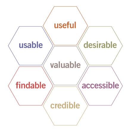
This methodology provides a simple framework that helps brands create websites with the following characteristics:
- Useful: Serve the purpose for they created it.
- Usability: Simple and easy to use.
- Accessible: Anyone can use it.
- Desirable: Provides positive emotion and is pleasant to use.
- Findable: Navigation is intuitive, and solutions are easy to find.
- Credible: Conveys in a believable or trustworthy manner.
- Valuable: Delivers on a promised value.
If you can fulfill all of the requirements in the honeycomb model, then you optimize your sales funnel paths naturally for conversions.
So for the rest of the article, I want to show you some ways that you draw a direct line between user experience, site architecture, and conversion rate optimization.
You’ll see without a doubt that site architecture is a viable path to increase your lead generation.
Reason #1: It gives your site utility
The first steps of the honeycomb model rely on creating a website that is useful and usable.
This addresses the utility and the function of your site in a few ideas that are easy to understand.
But just because they’re easy to understand doesn’t mean they’re easy to implement.
When building out your site’s architecture, you need to create an experience that helps your user find what they came for.
This natural flow is the first place to start when addressing the usability and usefulness of your website.
This ultimately determines how people interact with your website.
And how they interact with your website will, in turn, determine how many conversions you get in the long run.
Think of it in terms of an example involving a site that sells power tools.
On a well-designed website, this would be a logical flow of thought:
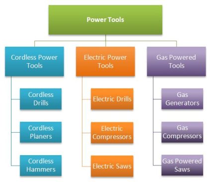
Users can navigate based on the type of tool that they want to find. The site then presents individual products according to whether they are cordless, electric, or gas powered.
Now imagine if you were to switch some of the products around.
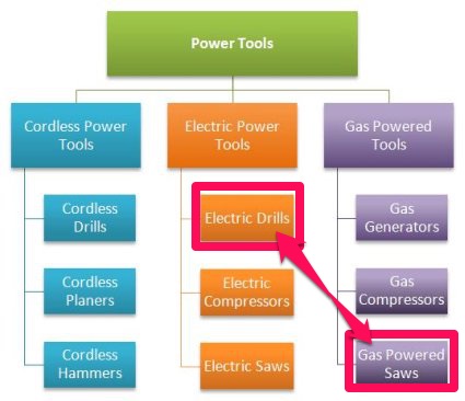
In this case, if you were trying to find a gas powered saw, you would naturally look under the gas powered tools.
If you misplace this in your site’s architecture, a user might navigate to the logical page but still be unable to find a product you actually have.
That means no matter how much you optimize the page, your organic traffic will struggle to navigate your site and may ultimately leave.
So when linking site architecture to conversion rates, the first place most brands start is with a mockup of what they want their users to achieve.
The purpose is to base the entire website design process on actual data and user behavior.
In the words of Paypal UX designer Larry Sawyer:
“They say a picture is worth a thousand words, but a mock-up is worth even more than that.”
So this design process typically follows a flow of testing, analysis, definition, ideating, prototyping, and then validating.
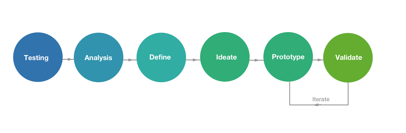
If you follow this particular model, you’ll be able to create a website that is usable by anyone in your audience and thus inherently useful to all parties.
So your initial goal is to optimize your site according to what visitors are doing.
You then take that information and analyze their behavior to see what stands out.
How they use your site defines what is essential, which further provides you the ideas you need to test if you want to improve your conversions.
From this information, you create a prototype of your website, and then validate your findings with additional testing.
If the prototype is invalid, you rinse and repeat until your site is in complete working order.
Keep in mind that this style of UX design does typically involve more design than just site architecture.
But for our purposes, we want to focus on the bigger picture.
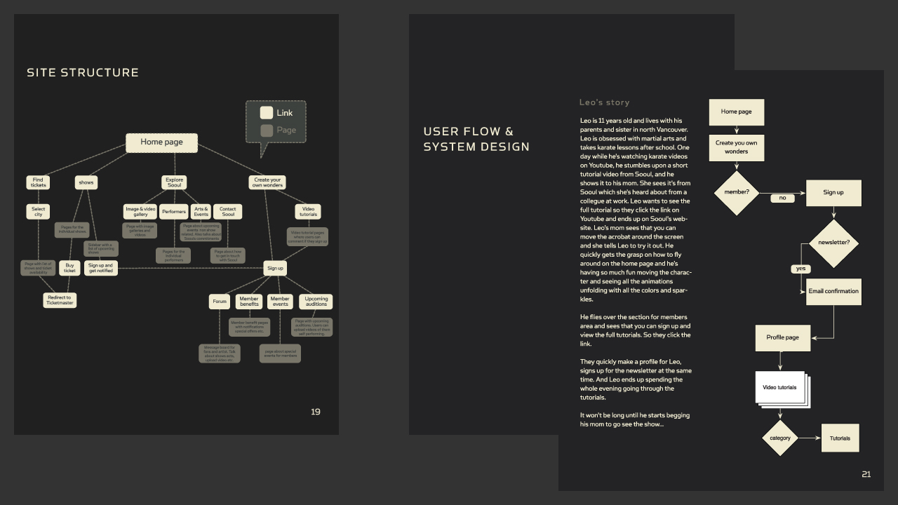
So when finally creating your site’s architecture mockup, many brands start with a comprehensive markup of how the elements of every page contribute to the user experience.
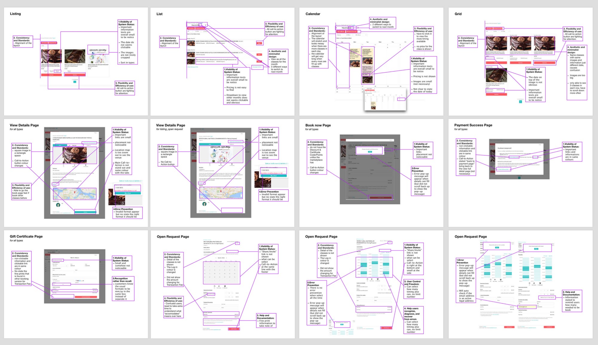
As this professional breakdown demonstrates, you can draw out and improve every aspect of your site.
From this exercise, you can create a basic outline of what your users should achieve on every page of your site.
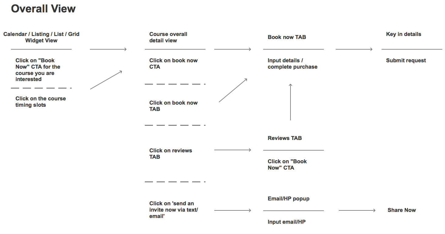
The purpose here is to take a vast amount of data from your original design and then strip it away until only a series of user actions remain.
This, in turn, dictates your site’s architecture as it is a direct representation of how you want your user to use your site.
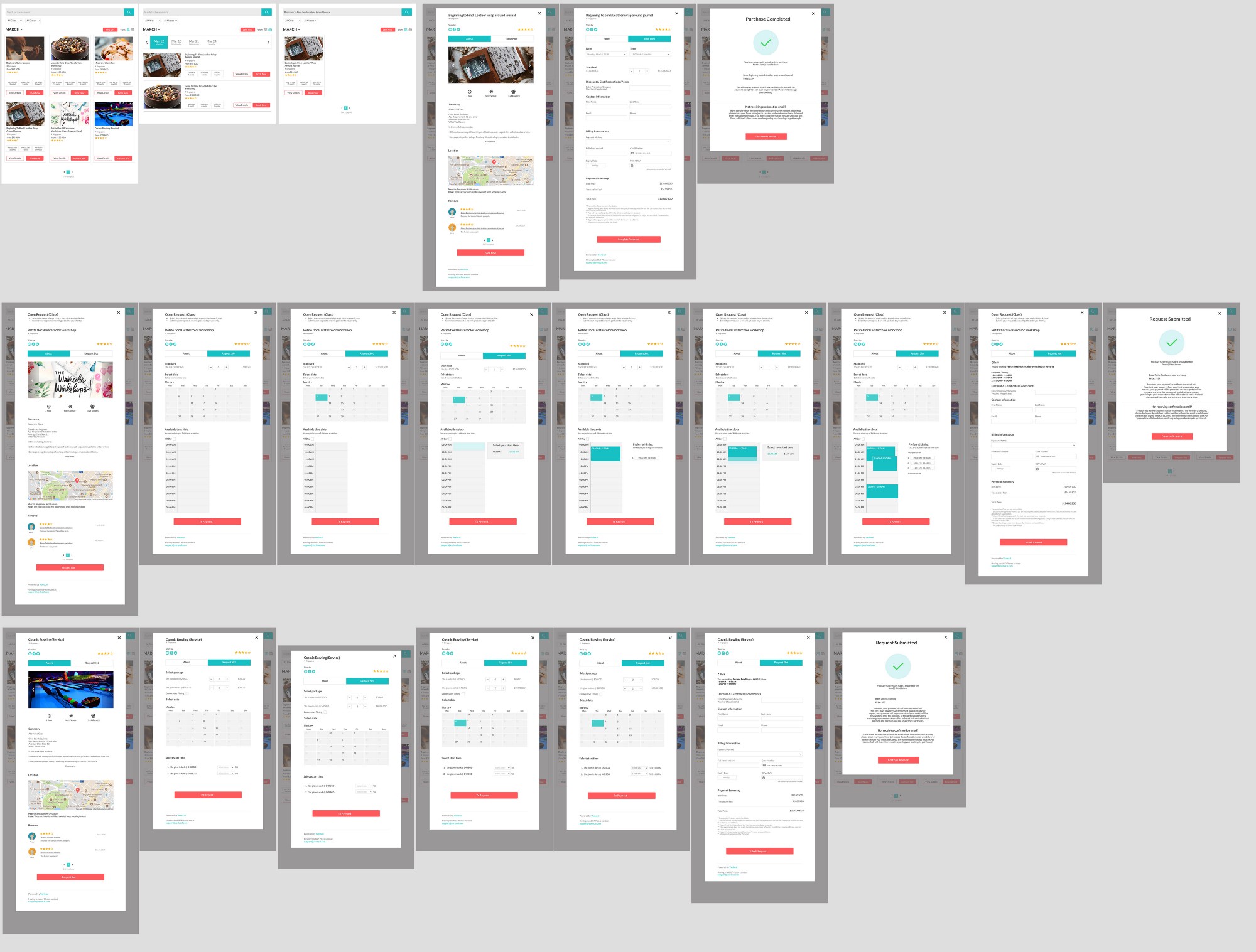
From this simplified design, one then typically creates a more comprehensive wireframe mockup.
 https://blog.kissmetrics.com/good-site-architecture/
No comments:
Post a Comment