Wednesday, 28 February 2018

4 Effective Tips to Create Customers for Life with the Perfect Onboard Messaging Sequence

The very beginning of any relationship is awkward.

Do you think your customers feel that way about the beginning of their relationship with you?

Because if they do, that’s bad. It’s a severe threat to your business!

It’s kind of like being on time for a party. Everyone’s feeling things out, sizing up the room, and trying to find a cozy place to gel while the party gets going. At least, that’s if things go smoothly.

Other times it’s more like those middle school dance parties where there are too many chaperones, and no one knows what to do.

So you stand around awkwardly until your mom picks you up.

As the saying goes, the “seeds of churn are planted early.“ Your customer onboarding experience will determine the overall quality and longevity of your business relationship.

But how do you create the perfect onboarding experience?

And better yet, how do you make it seem like you’re not overly market-ey?

Because a relationship should feel natural. It should be guidance and friendship instead of skywriting that says BUY NOW.

I know you get what I’m saying because you’ve probably been on both sides of that coin.

So I want to knuckle down in this post and show you how to avoid the early missteps and build bridges that will last a lifetime.

Your brand will flourish, your business will grow, and you might even feel a little more fulfillment in the connections you make.

I’m going to show you how to build the perfect onboard messaging sequence.

But first, let’s talk about why you should even pay attention to your onboarding in the first place.

Why you should care about your onboarding experience

Onboarding is a broad term.

It’s not a single instance you can point to and say “this is onboarding,” because it’s describing an entire process.

It’s the journey a customer takes from the first click to their first success.

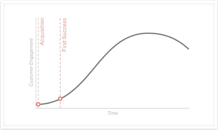
GrooveHQ conveys it well with a simple graph:

They’ve turned “first click” into “acquisition,” but the point is the same.

We’re specifically focusing on the beginning of the customer relationship, and we’re not just doing to call it a “sales thing.”

Anyone can do this and do it well.

One of the other terms you’ll hear thrown around when talking about onboarding is the concept of “churn.”

You’ve already heard me mention it, but I want to dig a little deeper before we progress.

Churn is synonymous with problems.

Let’s compare it to noticing one week into a new relationship that your girlfriend is hiding her phone.

The seeds of doubt – or of churn – are planted early.

This isn’t a new concept either.

The most significant problems usually start early in the process, and the same is true for customer relationships.

Where onboarding plays such a vital role is that the opposite of everything I just said is also true.

Seeds of churn can be planted early, but so are the seeds of success, as this anecdote from Kahuna Accounting conveys.

In just 12 months, they went from $0 to $480k annually.

How did they accomplish that?

They focused on their onboarding experience!

I’ll talk a little more about the specifics of what they did in a minute, but I want to wrap up our discussion about onboarding first.

According to Tallyfy, your onboarding experience should seek to answer two questions:

  1. Have you successfully introduced your new client to your business and addressed all their questions and concerns early on?
  2. Have you gathered information on your client so you have insight into what products and services would benefit them?

Let’s unwrap these two thoughts by looking at what AppCues did with their client Canva’s onboarding sequence.

How do they go about introducing themselves and addressing concerns?

For starters, they looked for growth opportunities and provided the organization with a way to gather data.

As you’ll see in the image below, there’s a link to a quick two-minute survey that they send in the welcome email.

I want to repeat that: they put it in the welcome email.

Why? Because they wanted to know if they were doing everything they could to satisfy their new customers.

Once their data confirmed that Canva knew their user base and provided for their needs, they decided to start forming hypotheses and experimenting.

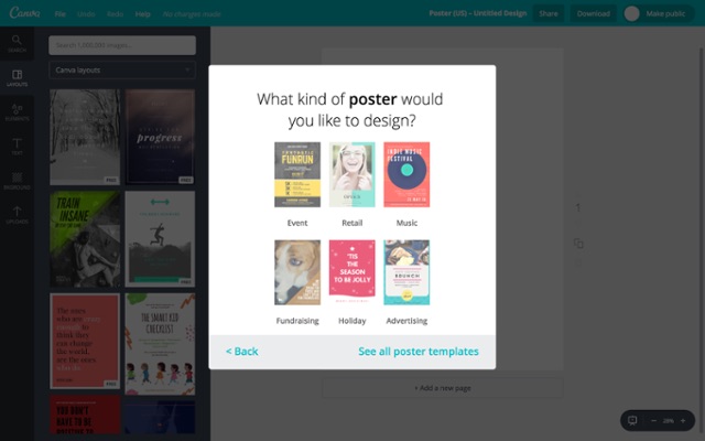
They revamped their onboarding sequence so that customers would see this upon arrival:

What were the results? They had a 10% increase in activation for this particular project type.

So you see that finding the right approach to take your client from acquisition to success is the onboarding sequence.

You’ll address their concerns and find new ways to benefit them.

I want to make one final point about customer onboarding, in case there’s any doubt in your mind about its importance.

Way back in 2000, Harvard Business School published a fascinating study that revealed one very telling fact:

In the long term, it’s more profitable to retain old customers than win new ones.

This is old-school knowledge, but it’s relevant nonetheless.

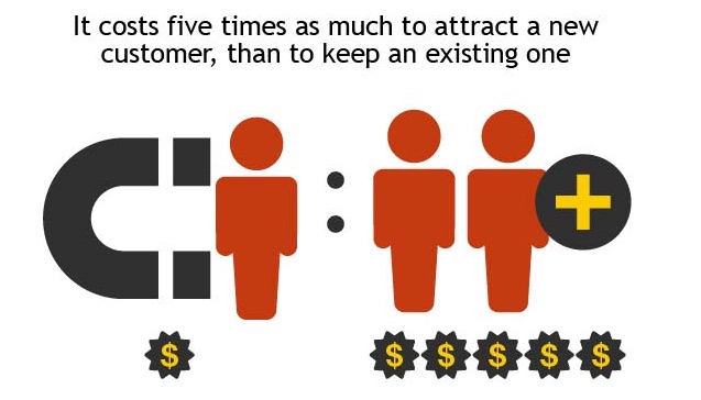
Retention has been proven time and again to be a cheaper and more profitable route than acquiring new customers.

And if the future of your relationships starts at its’ inception, then I hope you’re paying attention to what comes next.

1. Interview the Right People

To send the right message, you have to know what your audience wants to hear.

And you need to be able to do it across any industry, no matter the pain points.

I want to go back to our example from Kahuna Accounting for a moment, because what they did stands out as an excellent example of this approach.

Sixteen Ventures shared their story in a podcast, but here’s the gist of it:

They started with the assumption that their customers knew more than they did.

So to test that assumption, they interviewed anyone and everyone who was in their targeted niche.

They interviewed the ideal clients.

They questioned the clients you wouldn’t touch with a ten-foot pole.

They even found thought leaders and bloggers to talk to who would share their experiences.

By going incredibly narrow and capitalizing on their niche, they found that the world seemed to get smaller.

However, the interviews gave them direction. All of their marketing was poured into their findings.

They learned to speak their language and built a customer landing page to push their campaign.

They even wrote a whitepaper based on the information from the interviews.

Strategic ads, guest blogs, and collaborations abounded.

One year later, they’d gone from $0 to $480k. All because of some interviews.

You don’t always have the opportunity to ask questions in person though, and it’s not always about setting up interviews anyways.

Some services, like Shopify, re-engage with their target audience by reminding them of their pocketbook:

You may have set up a store with them, but they know the reason you’re using their platform is that you want to make money.

You can’t make money if your card isn’t connected.

So they use messaging like this to draw you back in.

They build a trust-oriented relationship that is beneficial for you and them, but they don’t lead with that.

They simply remind you that you can make more money. Cool idea, right?

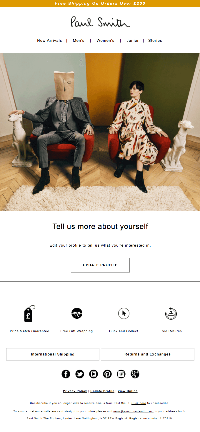
Here’s another example from fashion designer Paul Smith’s brand:

This is a really simple approach, but it falls in line with getting to know your customer better.

By asking newcomers or recent purchasers to set up a profile, they’re not only learning more about who they sell to, but they’re also deepening the impact of their brand.

Interview or no interview, these processes fall under the umbrella of a process called Customer Development.

Customer Development is a method of finding and qualifying the right market for your business. That’s essentially what Kahuna Accounting did.

The idea is to build a product around elements that solve your customers’ needs, then find the right ways to convert customers.

All of this is ideally accomplished while organizing your methods so that your business is scalable, too.

And this is a critical issue too because it’s a process by which you can answer the question “Is what I’m doing truly needed?” before you invest your time and money into an endeavor that will ultimately fail.

But that’s ultimately why interviews are so important, even when we get interview anxiety or feel awkward about it.

It’s a make-or-break situation, not an optional convenience.
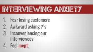
I absolutely love CustomerDevLab’s advice for interviews:

  1. Crawl
  2. Walk
  3. Run

It’s a little tongue-in-cheek, but it’s also spot on.

The process of escalating your interviews from partners to family and friends and then finally on to customers makes sense.

It provides a gradual and honest understanding of the environment around your businesses.

I highly recommend it.

If you want more guides and resources for Customer Development, I highly recommend you check out this compilation of 26 resources we put together.

2. Find out where your funnel is leaking

After you’ve done your interviews, it’s time to take a look inside your boat. Metaphorically speaking, that is.

What I mean is that you need to take a long, hard look at your sales funnel and find where people are falling out.

It doesn’t matter if it’s shortly after acquisition or just before the sale, knowing where and why your leads are dropping out will give you the knowledge to fix it.

Do you see the drop off between the first and second stages in the image above?

That shouldn’t happen!

It’s quite apparent that this part of the funnel has the most significant pain points, which means it deserves the most attention.

And before you get carried away and think that a massive drop like that is a failure, it’s not.

That’s an opportunity.

So how can you cash in on an opportunity like this?

It could be a number of things, but I’ll start with the issue we’ve been addressing all along: relationships.

It’s entirely plausible that a drop like this could mean you’re either asking for something too soon or not building enough trust.

Instapage gave some great advice on how you can also focus on relationships to increase conversion rates in your funnel. They recommend:

  • Show people they have a problem.
  • Define success on their terms.
  • Give leads more access to your product.
  • Show your leads more attention and treat them like people
  • Keep your cool through mistakes and churn.

If you’re human, that probably sounds a bit scary.

I know the first time I heard it I was a bit concerned.

You want me to tell people they have a problem but let them decide what success looks like?

I get that reaction! You’re putting so much power into your customer’s hands, but it pays to remember the Trust Equation here:
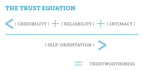
You’re attempting to build credibility, reliability, and intimacy to gain the unwavering trust of your customer.

Trust is what leads to relationships, and relationships lead to sales and retention. It’s all one big cycle that you have to trust.

Ironic, I know.

So focus on relationships first. And keep in mind that it’s also possible your problems have nothing to do with relationships.

Now, wait.

I just told you that you’re losing leads because of relationships, but then backed off and said you might not be losing leads because of relationships?

I know, it’s confusing. But I’m allowing for the possibility that you’re doing a great job and still have a leaky funnel. That’s entirely possible!

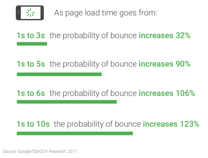
For example, you could be losing up to 53% of your landing page’s visitors just because of long load times.

Instapage recently shared that even a seven-second difference doubles the likelihood that a visitor won’t even stay around long enough to view your offer.

That means your onboarding is dead before it starts!

So the point here is though that ultimately you’ll only know where the holes in your funnel are if you’re paying attention.

And the even bigger truth is that you’ll only ever fix them if you are in tune with your customer relationships.

3. Check in regularly

Once you’ve patched up your funnel, you need to look a little deeper into the regularity of your messaging.

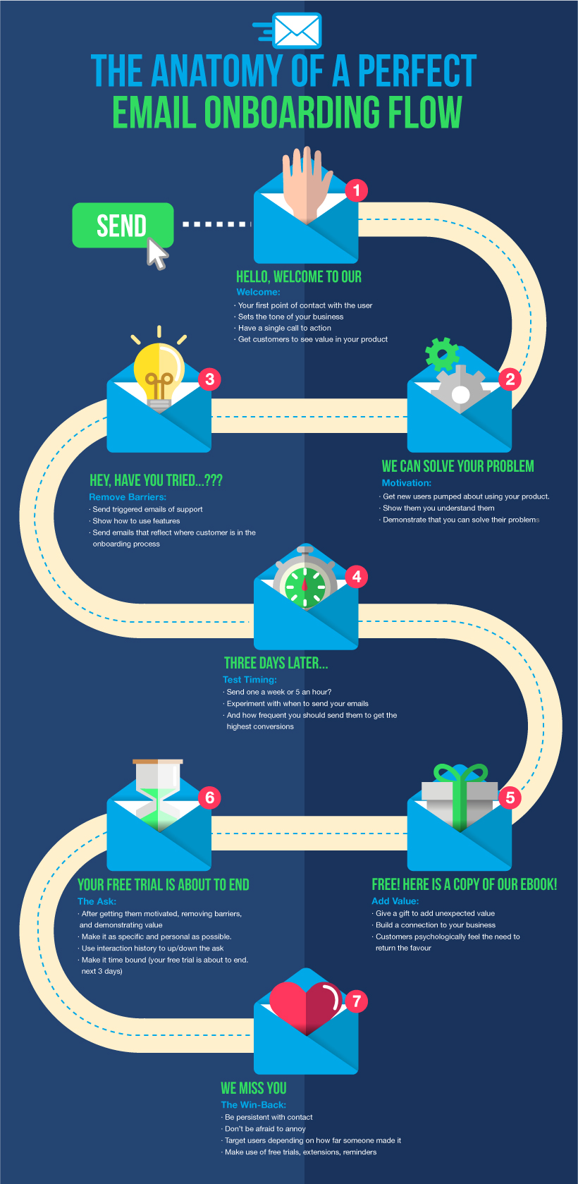
It’s the perfect opportunity to use all those tips on email onboarding you’ve been reading.

You’ll see a lot of elements from SparkPage’s Anatomy of a Perfect Email Onboarding Flow here.
https://blog.kissmetrics.com/perfect-onboard-messaging-sequence/
LittleThings blames its shutdown on Facebook algorithm change

littlethings office A recent Facebook algorithm change seems to have claimed a high-profile casualty: LittleThings, a digital publisher focused on inspirational and how-to content for women, which shut down yesterday. I wrote about the company at the beginning of 2016, when it raised debt funding from City National Bank. At the time, it seemed to be flying high, becoming one of the largest lifestyle publishers… Read More

source https://techcrunch.com/2018/02/28/littlethings-shutdown/?ncid=rss

Twitter launches Bookmarks, a private way to save tweets

 Twitter today is publicly launching its “Bookmarks” feature, which has been in testing since late last year, following the company’s HackWeek project dubbed #SaveForLater. A desire to save content for later reading is something people have asked for because of how much news circulates across Twitter, often including links to longer articles you don’t have time to read… Read More

source https://techcrunch.com/2018/02/28/twitter-launches-bookmarks-a-private-way-to-save-tweets/?ncid=rss

We Analyzed 10,000 Google Home Results. Here’s What We Learned About Voice Search SEO

Facebook rolls out job posts to become the blue-collar LinkedIn

 LinkedIn wasn’t built for low-skilled job seekers, so Facebook is barging in. Today Facebook is rolling out job posts to 40 more countries to make itself more meaningful to people’s lives while laying the foundation for a lucrative business. Businesses will be able to post job openings to a Jobs tab on their Page, Jobs dashboard, Facebook Marketplace, and the News Feed that they… Read More
source https://techcrunch.com/2018/02/28/facebook-job-posts/?ncid=rss

Tuesday, 27 February 2018

Announcing the Newest Kissmetrics Connection: Facebook Audiences

Kissmetrics Populations lets you track key segments of your user base. In just a few steps, you can track user activity, marketing performance, and product engagement.

And now we’re making it even better.

With our latest iteration, you can connect a Population to a Facebook Custom Audience for even greater targeting and tracking in Kissmetrics.

Let’s see how it works.

The Facebook Custom Audiences <> Kissmetrics Populations Connection

Facebook Audiences is an advertising product from Facebook that lets marketers advertise to existing customers. As long as you have email addresses, you can advertise to that group on Facebook through Audiences.

Here’s where Kissmetrics Populations comes in.

If you’re using Kissmetrics and identifying your users by their email, you can turn a Population into an Audience on Facebook that you can then advertise to.

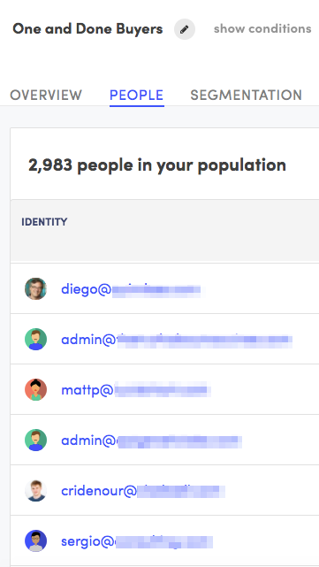
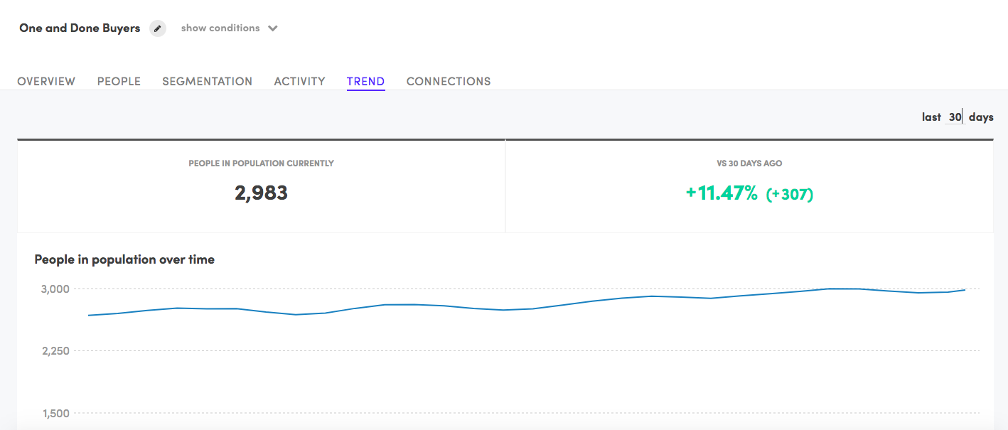
Let’s say you’re an eCommerce company and have created a Population for the one and done buyers – the people that made their first purchase 6 months ago but haven’t made one since. Here’s how that Population may look:

We see that there are 2,983 people in this Population. If we scroll down, we’ll see the users email addresses:

These customers are ripe for a new advertising campaign. We’ll create an advertisement on Facebook that offers them 10% back off their next purchase.

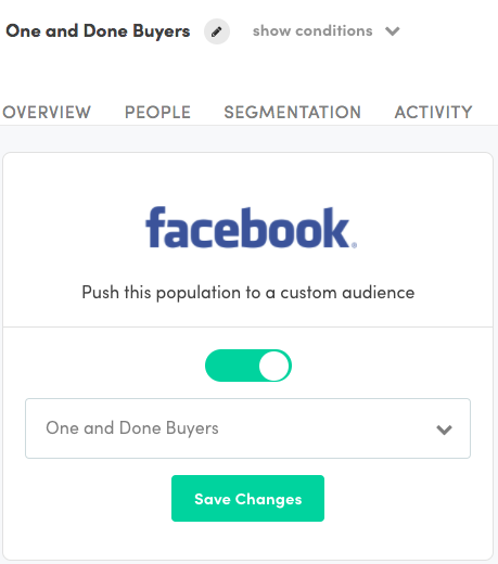
So, with this Population in our hand, we’ll move over in Kissmetrics and click on the Connections tab and Authorize the Facebook connection:

And just like that, you have your new Custom Audience in Facebook. And the best part is that it will automatically update when new people enter the Population, or people leave the Population. So if you get a user who was in this Population and advertise to them and they come back and make a purchase, they’ll automatically be removed from the Population in Kissmetrics, which will update the Custom Audience in Facebook.

3 Populations You Can Create Right Now

Populations are a great fit for eCommerce stores. Here’s 3 Populations you can create right now:

1. The “Browsers”

These are the groups of people who continually visit your eCommerce store, but never actually make a purchase. Keeping track of this Population will help you know how well your site is converting prospects, as well as how many people are just browsing without buying. In many cases, this may indicate how many people are price shopping your store.

Keep in mind that you will have to have that person’s email address before you can move them to a custom audience in Facebook. In many cases, a person will give you their email address for signing up for an email newsletter. You can promote something like “10% off your first purchase when you sign up for our newsletter” and you’ll probably get a barrage of new emails to your list. Once you have that, you can then track the browsers and advertise to them on Facebook.

2. Customers That Haven’t Purchased After X Amount of Days

Since most eCommerce stores don’t have a recurring revenue model, they need customers coming back to purchase. Many stores incentivize this through loyalty programs. With Populations, you can track how many customers haven’t purchased from you after a certain amount of time. Then you’ll connect that Population to Facebook and advertise to those customers to win them back and earn a repurchase.

3. Lost Loyalists

Loyal customers are great. They keep your business alive and thriving. So needless to say, you don’t want to lose them. But, it’s inevitable that some of your loyal customers will be moving some of their purchases to other stores. That’s why you’ll want to keep track of how many of these “lost loyalists” you’ve had over the months.

Log in to Start Using Populations

If you’re a Kissmetrics customer, you can login and start using the new Populations <> Facebook integration. If you have any questions, you can reach out to our support team and we’ll be more than happy to help you.

If you aren’t a Kissmetrics customer but would like to learn more, you can request a demo.

Don’t Miss Out on other Connections

Connections go beyond Facebook.

If you use Slack, you can use our Populations connection to stay on top of all your Populations without having to logging into Facebook.

Our HubSpot connection will enrich any customer profile in Hubspot with data from Kissmetrics.

And we have many more connections coming. Stay tuned to this blog for future product announcements.


source https://blog.kissmetrics.com/announcing-the-newest-kissmetrics-connection-facebook-audiences/

Facebook launches a local news accelerator for publishers

 Facebook is trying to play extra nice with local news publishers by putting $3 million behind the launch of the Local News Subscriptions Accelerator. The three-month pilot program will help 10 to 15 U.S.-based metropolitan news organizations gain more digital subscribers both on and off Facebook. Read More
source https://techcrunch.com/2018/02/27/facebook-launches-a-local-news-accelerator-for-publishers/?ncid=rss

Facebook should disclose and limit pricing for political campaign ads

 An interesting reporton the Facebook ad machinery in play during the election highlighted an issue that I hadn’t considered: Facebook’s ad marketplace gave a huge pricing advantage to one candidate over the other. It seems like a no-brainer that these differences should at least be made public in the case of political contests, and arguably should be limited in the way political… Read More

source https://techcrunch.com/2018/02/27/facebook-should-disclose-and-limit-pricing-for-political-campaign-ads/?ncid=rss

Despite backlash to the redesign, Snapchat downloads are up

 “What’s all the fuss about?” Curiosity over why people are protesting the Snapchat redesign seems to have inspired a new wave of users to try the app. Snapchat downloads in the U.S. went up 41 percent to 76 percent in the week following the redesign’s February 6th rollout compared to the week before, according to data provided exclusively to TechCrunch by Sensor Tower.… Read More

source https://techcrunch.com/2018/02/27/surfing-the-hate-wave/?ncid=rss

Google's Walled Garden: Are We Being Pushed Out of Our Own Digital Backyards?

Posted by Dr-Pete

Early search engines were built on an unspoken transaction — a pact between search engines and website owners — you give us your data, and we'll send you traffic. While Google changed the game of how search engines rank content, they honored the same pact in the beginning. Publishers, who owned their own content and traditionally were fueled by subscription revenue, operated differently. Over time, they built walls around their gardens to keep visitors in and, hopefully, keep them paying.

Over the past six years, Google has crossed this divide, building walls around their content and no longer linking out to the sources that content was originally built on. Is this the inevitable evolution of search, or has Google forgotten their pact with the people's whose backyards their garden was built on?

I don't think there's an easy answer to this question, but the evolution itself is undeniable. I'm going to take you through an exhaustive (yes, you may need a sandwich) journey of the ways that Google is building in-search experiences, from answer boxes to custom portals, and rerouting paths back to their own garden.


I. The Knowledge Graph

In May of 2012, Google launched the Knowledge Graph. This was Google's first large-scale attempt at providing direct answers in search results, using structured data from trusted sources. One incarnation of the Knowledge Graph is Knowledge Panels, which return rich information about known entities. Here's part of one for actor Chiwetel Ejiofor (note: this image is truncated)...

The Knowledge Graph marked two very important shifts. First, Google created deep in-search experiences. As Knowledge Panels have evolved, searchers have access to rich information and answers without ever going to an external site. Second, Google started to aggressively link back to their own resources. It's easy to overlook those faded blue links, but here's the full Knowledge Panel with every link back to a Google property marked...

Including links to Google Images, that's 33 different links back to Google. These two changes — self-contained in-search experiences and aggressive internal linking — represent a radical shift in the nature of search engines, and that shift has continued and expanded over the past six years.

More recently, Google added a sharing icon (on the right, directly below the top images). This provides a custom link that allows people to directly share rich Google search results as content on Facebook, Twitter, Google+, and by email. Google no longer views these pages as a path to a destination. Search results are the destination.

The Knowledge Graph also spawned Knowledge Cards, more broadly known as "answer boxes." Take any fact in the panel above and pose it as a question, and you're likely to get a Knowledge Card. For example, "How old is Chiwetel Ejiofor?" returns the following...

For many searchers, this will be the end of their journey. Google has answered their question and created a self-contained experience. Note that this example also contains links to additional Google searches.

In 2015, Google launched Medical Knowledge Panels. These gradually evolved into fully customized content experiences created with partners in the medical field. Here's one for "cardiac arrest" (truncated)...

Note the fully customized design (these images were created specifically for these panels), as well as the multi-tabbed experience. It is now possible to have a complete, customized content experience without ever leaving Google.


II. Live Results

In some specialized cases, Google uses private data partnerships to create customized answer boxes. Google calls these "Live Results." You've probably seen them many times now on weather, sports and stock market searches. Here's one for "Seattle weather"...

For the casual information seeker, these are self-contained information experiences with most or all of what we care about. Live Results are somewhat unique in that, unlike the general knowledge in the Knowledge Graph, each partnership represents a disruption to an industry.

These partnerships have branched out over time into even more specialized results. Consider, for example, "Snoqualmie ski conditions"...

Sports results are incredibly disruptive, and Google has expanded and enriched these results quite a bit over the past couple of years. Here's one for "Super Bowl 2018"...

Note that clicking any portion of this Live Result leads to a customized portal on Google that can no longer be called a "search result" in any traditional sense (more on portals later). Special sporting events, such as the 2018 Winter Olympics, have even more rich features. Here are some custom carousels for "Olympic snowboarding results"...

Note that these are multi-column carousels that ultimately lead to dozens of smaller cards. All of these cards click to more Google search results. This design choice may look strange on desktop and marks another trend — Google's shift to mobile-first design. Here's the same set of results on a Google Pixel phone...

Here, the horizontal scrolling feels more intuitive, and the carousel is the full-width of the screen, instead of feeling like a free-floating design element. These features are not only rich experiences on mobile screens, but dominate mobile results much more than they do two-column desktop results.

III. Carousels

Speaking of carousels, Google has been experimenting with a variety of horizontal result formats, and many of them are built around driving traffic back to Google searches and properties. One of the older styles of carousels is the list format, which runs across the top of desktop searches (above other results). Here's one for "Seattle Sounders roster"...

Each player links to a new search result with that player in a Knowledge Panel. This carousel expands to the width of the screen (which is unusual, since Google's core desktop design is fixed-width). On my 1920x1080 screen, you can see 14 players, each linking to a new Google search, and the option to scroll for more...

This type of list carousel covers a wide range of topics, from "cat breeds" to "types of cheese." Here's an interesting one for "best movies of 1984." The image is truncated, but the full result includes drop-downs to select movie genres and other years...

Once again, each result links to a new search with a Knowledge Panel dedicated to that movie. Another style of carousel is the multi-row horizontal scroller, like this one for "songs by Nirvana"...

In this case, not only does each entry click to a new search result, but many of them have prominent featured videos at the top of the left column (more on that later). My screen shows at least partial information for 24 songs, all representing in-Google links above the traditional search results...

A search for "laptops" (a very competitive, commercial term, unlike the informational searches above) has a number of interesting features. At the bottom of the search is this "Refine by brand" carousel...

Clicking on one of these results leads to a new search with the brand name prepended (e.g. "Apple laptops"). The same search shows this "Best of" carousel...

The smaller "Mentioned in:" links go to articles from the listed publishers. The main, product links go to a Google search result with a product panel. Here's what I see when I click on "Dell XPS 13 9350" (image is truncated)...

This entity live in the right-hand column and looks like a Knowledge Panel, but is commercial in nature (notice the "Sponsored" label in the upper right). Here, Google is driving searchers directly into a paid/advertising channel.

IV. Answers & Questions

As Google realized that the Knowledge Graph would never scale at the pace of the wider web, they started to extract answers directly from their index (i.e. all of the content in the world, or at least most of it). This led to what they call "Featured Snippets", a special kind of answer box. Here's one for "Can hamsters eat cheese?" (yes, I have a lot of cheese-related questions)...

Featured Snippets are an interesting hybrid. On the one hand, they're an in-search experience (in this case, my basic question has been answered before I've even left Google). On the other hand, they do link out to the source site and are a form of organic search result.

Featured Snippets also power answers on Google Assistant and Google Home. If I ask Google Home the same question about hamsters, I hear the following:

On the website TheHamsterHouse.com, they say "Yes, hamsters can eat cheese! Cheese should not be a significant part of your hamster's diet and you should not feed cheese to your hamster too often. However, feeding cheese to your hamster as a treat, perhaps once per week in small quantities, should be fine."

You'll see the answer is identical to the Featured Snippet shown above. Note the attribution (which I've bolded) — a voice search can't link back to the source, posing unique challenges. Google does attempt to provide attribution on Google Home, but as they use answers extracted from the web more broadly, we may see the way original sources are credited change depending on the use case and device.

This broader answer engine powers another type of result, called "Related Questions" or the "People Also Ask" box. Here's one on that same search...

These questions are at least partially machine-generated, which is why the grammar can read a little oddly — that's a fascinating topic for another time. If you click on "What can hamsters eat list?" you get what looks a lot like a Featured Snippet (and links to an outside source)...

Notice two other things that are going on here. First, Google has included a link to search results for the question you clicked on (see the purple arrow). Second, the list has expanded. The two questions at the end are new. Let's click "What do hamsters like to do for fun?" (because how can I resist?)...

This opens up a second answer, a second link to a new Google search, and two more answers. You can continue this to your heart's content. What's especially interesting is that this isn't just some static list that expands as you click on it. The new questions are generated based on your interactions, as Google tries to understand your intent and shape your journey around it.

My colleague, Britney Muller, has done some excellent research on the subject and has taken to calling these infinite PAAs. They're probably not quite infinite — eventually, the sun will explode and consume the Earth. Until then, they do represent a massively recursive in-Google experience.


V. Videos & Movies

One particularly interesting type of Featured Snippet is the Featured Video result. Search for "umbrella" and you should see a panel like this in the top-left column (truncated):

This is a unique hybrid — it has Knowledge Panel features (that link back to Google results), but it also has an organic-style link and large video thumbnail. While it appears organic, all of the Featured Videos we've seen in the wild have come from YouTube (Vevo is a YouTube partner), which essentially means this is an in-Google experience. These Featured Videos consume a lot of screen real-estate and appear even on commercial terms, like Rihanna's "umbrella" (shown here) or Kendrick Lamar's "swimming pools".

Movie searches yield a rich array of features, from Live Results for local showtimes to rich Knowledge Panels. Last year, Google completely redesigned their mobile experience for movie results, creating a deep in-search experience. Here's a mobile panel for "Black Panther"...

Notice the tabs below the title. You can navigate within this panel to a wealth of information, including cast members and photos. Clicking on any cast member goes to a new search about that actor/actress.

Although the search results eventually continue below this panel, the experience is rich, self-contained, and incredibly disruptive to high-ranking powerhouses in this space, including IMDB. You can even view trailers from the panel...

On my phone, Google displayed 10 videos (at roughly two per screen), and nine of those were links to YouTube. Given YouTube's dominance, it's difficult to say if Google is purposely favoring their own properties, but the end result is the same — even seemingly "external" clicks are often still Google-owned clicks.


VI. Local Results

A similar evolution has been happening in local results. Take the local 3-pack — here's one on a search for "Seattle movie theaters"...

Originally, the individual business links went directly to each of those business's websites. As of the past year or two, these instead go to local panels on Google Maps, like this one...

On mobile, these local panels stand out even more, with prominent photos, tabbed navigation and easy access to click-to-call and directions.

In certain industries, local packs have additional options to run a search within a search. Here's a pack for Chicago taco restaurants, where you can filter results (from the broader set of Google Maps results) by rating, price, or hours...

Once again, we have a fully embedded search experience. I don't usually vouch for any of the businesses in my screenshots, but I just had the pork belly al pastor at Broken English Taco Pub and it was amazing (this is my personal opinion and in no way reflects the taco preferences of Moz, its employees, or its lawyers).

The hospitality industry has been similarly affected. Search for an individual hotel, like "Kimpton Alexis Seattle" (one of my usual haunts when visiting the home office), and you'll get a local panel like the one below. Pardon the long image, but I wanted you to have the full effect...

This is an incredible blend of local business result, informational panel, and commercial result, allowing you direct access to booking information. It's not just organic local results that have changed, though. Recently, Google started offering ads in local packs, primarily on mobile results. Here's one for "tax attorneys"...

Unlike traditional AdWords ads, these results don't go directly to the advertiser's website. Instead, like standard pack results, they go to a Google local panel. Here's what the mobile version looks like...

In addition, Google has launched specialized ads for local service providers, such as plumbers and electricians. These appear carousel-style on desktop, such as this one for "plumbers in Seattle"...

Unlike AdWords advertisers, local service providers buy into a specialized program and these local service ads click to a fully customized Google sub-site, which brings us to the next topic — portals.


VII. Custom Portals

Some Google experiences have become so customized that they operate as stand-alone portals. If you click on a local service ad, you get a Google-owned portal that allows you to view the provider, check to see if they can handle your particular problem in your zip code, and (if not) view other, relevant providers...

You've completely left the search result at this point, and can continue your experience fully within this Google property. These local service ads have now expanded to more than 30 US cities.

In 2016, Google launched their own travel guides. Run a search like "things to do in Seattle" and you'll see a carousel-style result like this one...

Click on "Seattle travel guide" and you'll be taken to a customized travel portal for the city of Seattle. The screen below is a desktop result — note the increasing similarity to rich mobile experiences.

Once again, you've been taken to a complete Google experience outside of search results.

Last year, Google jumped into the job-hunting game, launching a 3-pack of job listings covering all major players in this space, like this one for "marketing jobs in Seattle"...

Click on any job listing, and you'll be taken to a separate Google jobs portal. Let's try Facebook...

From here, you can view other listings, refine your search, and even save jobs and set up alerts. Once again,

source https://moz.com/blog/googles-walled-garden