It takes just 50 milliseconds for users to form an opinion about a website.
To put this into context, an average human blink takes about 100-400 milliseconds. To say that we judge websites in the blink of an eye would be an overstatement.
When you have so little time to make an impression, it’s crucial that you get your design right.
One overlooked element of modern design is the hero image.
The hero image dominates the above the fold area, yet it is often hastily chosen without any consideration for its effect on the user-experience or conversion rates.
In this article, I’m going to show you how you can select the right kind of hero image to grab attention, convert users and complement your design.
Rethinking Hero Images
As Wikipedia puts it, a hero image is a…
“…large banner image, prominently placed on a web page, generally in the front and center. The hero image is often the first visual a visitor encounters on the site and its purpose is to present an overview of the site’s most important content”
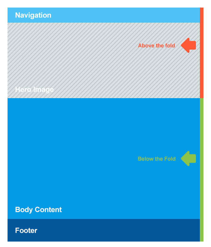
If you were to break down a conventional website’s structure, the hero image would dominate the first half of the screen (i.e. the above the fold area).
This area (above the fold) is critical for engagement and conversions. After all, it’s the first thing visitors see when they land on your site.
According to one study by NNGroup, users focus roughly 80.3% of their attention above the fold. They mostly scroll through the rest of the content before perking up again near the footer.
At the same time, your users also judge your site’s trustworthiness and quality based on its design.
In fact, in one study, 94% of the reasons cited by participants for mistrusting a website were design-related.
This calls for a complete rethinking of the way we use hero images. Instead of choosing images that add visual flair to a page, choose images that engage, persuade and move users.
Since hero images dominate the above the fold area, it is critical that you pick something that not only looks good but also pushes your conversion goals.
Below, I’ll show you the 7 different types of hero images and how to pick something that works for your site.
7 Types of Hero Images
After going through numerous websites I have broadly categorized hero images into 7 categories.
It goes without saying, there is no category better than the other. Deciding which type of hero image to choose is based on the kind of business you have (see more below).
It’s always a good idea to A/B test different types of hero images and see which one works best with your audience.
1. Product hero image
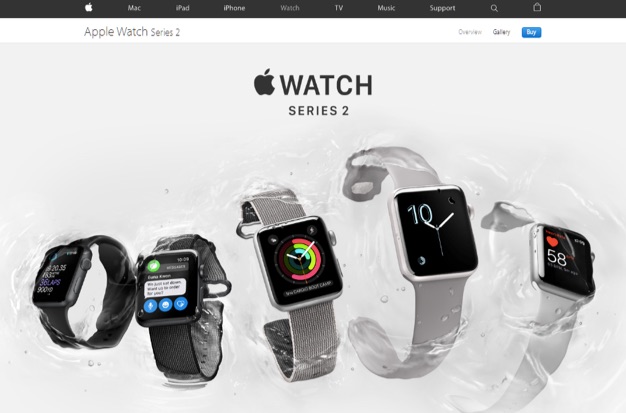
This image type shows off your product. These images work best for conventional products like furniture, gadgets, phones, etc.
Apple is a perfect example. Since design is Apple’s biggest strength, it makes sure to highlight its product design on every landing page.
Here’s another example from SOMA which makes sustainable water filters. The hero image not only shows off the product but also uses SOMA’s brand colors.
2. Contextual hero image
This image type shows your product in context, i.e. not just how your product looks, but how it works in a real setting.
Contextual hero images work best for products that are difficult to understand. Think “show, don’t tell” – instead of writing a lengthy description, you can just use an image to show what the product does.
June Oven is a great example:
The static shot of the video establishes that the product is an a) oven, and that b) it has a bunch of different cooking modes.
The actual video shows someone adjusting the temperature from low to medium, showing exactly how the oven works.
3. Emotion-focused hero image
This category of images focuses on amplifying an emotion you want your users to feel. This works great for non-physical products or services where you need to emphasize the effects of the product/service.
Honor, for example, provides home care professionals for parents. Their hero image shows love and compassion between an older woman and one of Honor’s professionals.
As a service, Honor wants you to feel that your parents will be loved and taken care of. This picture does a great job at showing that exact emotion.
4. Founder-focused hero image
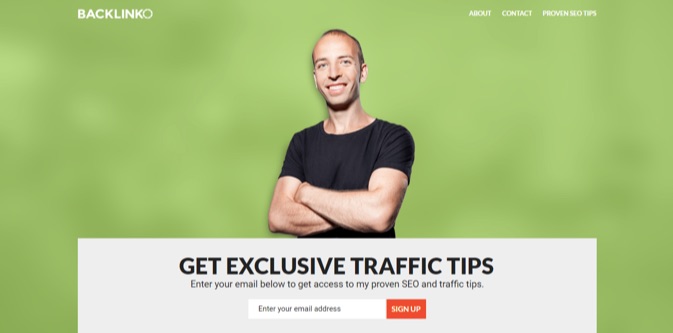
This hero image places the company’s founder at the center of attention. You’ll usually find these on sites where the business is closely associated with the founder.
For example, Backlinko’s Brian Dean uses his own image as the hero image.
Obviously, the founder-focused image has very limited applications outside of a few niche businesses. It can work for Backlinko and Ramit Sethi, but it can’t work for Microsoft or some new productivity app.
5. “Behind the scenes” hero image
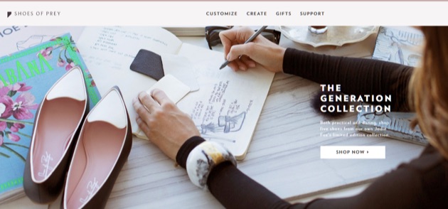
This type shows the “making of” of a product. Works best with artisan products that have a touch of craftsmanship. You can show the design process or the manufacturing process.
For example, Shoes of Prey shows the founder’s “inspiration notebook” with ideas for different shoes and the design process.
6. “Action shot” hero image
This hero image focuses on capturing the user’s attention with dramatic imagery. It isn’t particularly persuasive as compared to the other types but helps separate your brand from the noise.
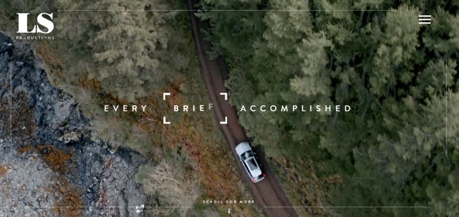
LSProductions, for instance, uses shots from its showreel on its homepage video. You can’t tell exactly what they do, but the imagery is stunning enough to hold your interest.
7. Benefits-focused hero image
This hero image focuses on the product’s benefits, rather than how it works. It is somewhat similar to the emotion-amplifying hero image, except it focuses on the product’s immediate benefits, not how it makes you feel.
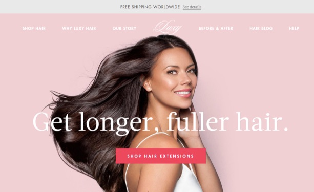
For example, LuxuryHair has a hero image of a model with long, thick hair next to the benefit: “get longer, fuller hair”.
There are plenty of other hero-image types (such as the before/after, the solid background, the animated image, etc.) but for most purposes, you’ll find the above seven adequate enough.
The hard part now is selecting the right hero image.
I’ll show you how to do that below.
Selecting the Right Hero Image
Your hero image must do two things simultaneously:
- Capture attention (and look good)
- Show off your product or amplify the emotion you’re trying to create
Finding images that can do both is harder than it appears.
Let’s look at some things you should keep in mind when selecting hero images:
1. Emphasize clarity
The whole idea of a hero image is to make the visitor immediately know what your hero image is about and what idea it wants to convey.
Stick to the “one idea per image rule”.
This means that if you’re using a product shot, the image must only focus on the product (and not have the founder dominate half the screen space).
It’s also a good idea to pick an image that resonates with your copy (the headline). If you can make the image amplify the copy, you’ll be gold.
For example, Acme, an industrial solutions provider, has an optimistic hero image that matches its future-focused tagline.
This is the sort of connection you need to strive for.
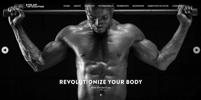
Here’s another example from Art of Sculpting:
The copy here might not connect directly with the image, but the message resonates nevertheless.
2. Use color effectively
Your brand is judged based on the colors you use.
There have already been countless attempts to classify consumer responses to different individual colors.
It’d be fair to say we all prefer different colors based on our past experiences. There is no one color that you can implement which will be loved by everyone in your audience.
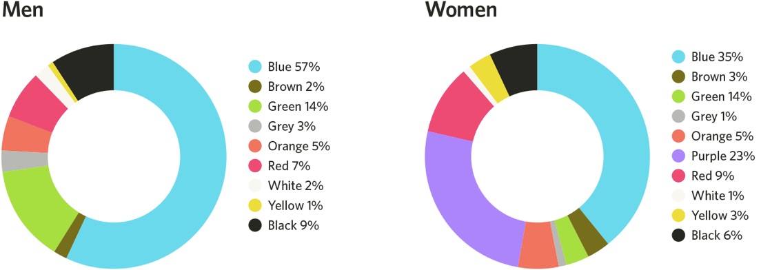
For example, according to Joe Hallock’s work on “Colour Assignment”, there is a clear difference between men and women color preferences.
For some reason blue emerges as a clear winner among both men and women (which means that it’s a safe color for hero images).
You can use color in your hero images to add character to an image or to appeal to a certain emotion.
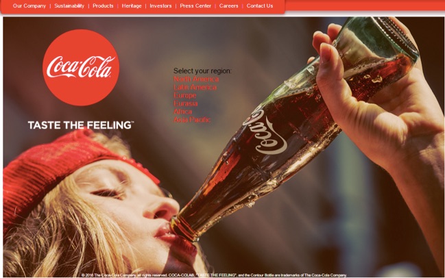
Red, for instance, is often called a “passionate” color. Sure enough, Coca-Cola uses it in all its hero images (which also happens to be its brand color):
Try playing with multiple colors or using contrasting colors to make your hero image pop.
Spotify’s Found them First is a great example. They use vibrant colors to make otherwise dull artist photographs stand out:
Let’s not forget our objective here, that is, to get people to click on the CTA. Contrasting colors do a great job at making your CTA stand out.
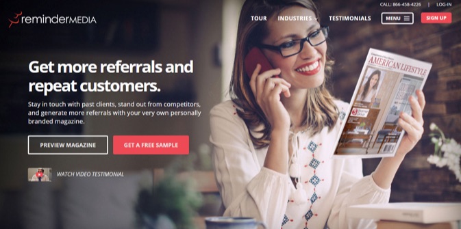
For example, look at ReminderMedia’s hero image and the CTAs color contrast. “Get A Free Sample” and “Sign Up” stand out and capture attention.
3. Be aware of the power of faces
Never underestimate the power of human faces. People immediately relate to them. You can also use them to guide visitors to your value proposition.
Studies have shown that humans will naturally follow the gaze of other humans. You can use this to your advantage by using a picture of someone who looks directly at your CTA.
For example, The Renovator uses the downward gaze of the model to guide your eyes to the “Scroll Down” CTA.
4. Ensure consistency
If your company deals in sky diving equipment, would it make sense for you to put up a hero image of a person scuba diving?
It only makes sense to relate your hero image to the rest of your website. The image must reflect your brand’s values and principles.
At the same time, there should be consistency in your image at the top of the page and at the bottom of the page.
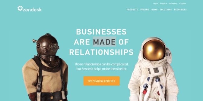
For example, Zendesk uses the hero image to introduce a motif – aquanaut meets astronaut – that they repeat through the page to narrate their brand story.
Their homepage shows an image of a scuba diver (an aquanaut) and an astronaut – two people who are far apart (in their destination). One dives in the depth of the ocean and the other explores the vast reaches of space.
They are pointing out their tagline “Businesses Are Made of Relationships” and want you to think (visually) – no matter how far apart your professions are, their software will help bridge the gap.
To further emphasize on the latter, they show an image of both of them having coffee together at the bottom of the page.
https://blog.kissmetrics.com/hero-images-that-boost-conversions/







No comments:
Post a Comment