For brands to stay relevant in our fast-paced, mobile and multi-channel world, they must show more value, more novelty, and more values than ever before. The traditional marketing of old — TV commercials, catalogs and most importantly word of mouth, are still very relevant today. Consumer attention, even a second of it, is worth more than gold today, and consumers feel this.
Because of this pressure cooker of demand for their attention, consumers actually appreciate this more traditional type of marketing. The “slow” movements of today — slow food and slow travel, for example — are in reaction to the rapid-fire pace of modern consumer life. Traditional branding and marketing are the “slow marketing” of today, allowing brands and consumers to take a step back in time to a simpler consumer-brand relationship.
With that being said, we are now in a different time — the era of AI, VR and chatbots. If a brand exclusively relies on old school marketing, they run the risk of becoming irrelevant, stale or out of touch. The smart digital marketing, or marketing technology of today can actually help brands position themselves to be at the forefront in their industries.
Marketing Technology
Martech, shorthand for MARketing TECHnology, are tools that assist marketing professionals in reaching their target audience and marketing goals. These platforms can take the form of email marketing, inbound or outbound marketing, social media marketing, marketing automation, or customer data platforms. Some martech platforms strive to be all-in-one tools, whereas many others perform specific tasks such as user segmentation or landing page optimization. Martech’s use of AI and machine learning actually helps brands connect better emotionally with consumers, touching an important nerve that gives them an edge.
A marketing strategy that combines these two approaches is what really works. Covering all bases ensures a far-reaching approach that can gain all types of consumers, young and old, high-tech and low. Nordstrom, 1-800-Flowers.com and Sephora are three brands that have a well-rounded, varied marketing strategy that utilizes traditional marketing with the new martech to reach impressive heights with ROI, brand awareness and brand loyalty.
Let’s first take a look at how the luxury department store brand Nordstrom pairs its century-old traditional values with 21st century technology.
Nordstrom
Nordstrom, the beloved brand that is most known for its all-star customer service, exemplifies the marketing marriage between old school and new by maintaining its core value set while experimenting with new marketing and e-commerce technology.
Nordstrom opened its doors over a century ago, and has reigned as a customer favorite ever since. They are currently number one in customer satisfaction according to a wide-ranging Market Force survey. Their customer service reputation and brand loyalty is what sets them apart. They are known for a liberal and generous return policy; on the Nordstrom.com website, it states, “We handle returns on a case-by-case basis with the ultimate objective of making our customers happy.” There is no time limit for returns per se, and shopping is a full and pleasant experience. Nordstrom’s traditional marketing also includes the monthly Nordstrom catalog and Nordstrom credit card points.
Their new school marketing approach includes a Nordstrom branded app, their website with extensive user generated content and reviews, and their forward-thinking Pinterest buyable pins.
Let’s dig into each.
Pinterest Buyable Pins
Pinterest announced last year that users would be able to purchase pins directly on the platform. Nordstrom was one of the large retail brands to get on board. This is a way for a consumer to securely purchase the ‘pin’ or item they are interested in, directly on Pinterest without having to leave the platform.
User-Generated Content
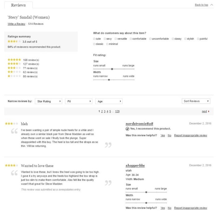
Nordstrom.com has built up a robust and effective review and ratings system native to it’s website. A review consists of a written section, a 5-star rating system, the option to check boxes with qualities that describe the item, a scale to note if the item runs small or large, wide or thin (for shoes). There is also an option for the user to state whether the review was helpful or not. The user can sort reviews by rating, fit and even age! Just one pair of shoes can have a thread of over 500 reviews (see below). This is a massive amount of user-generated content, for users, by users.
Nordstrom’s branded app
Available for iOS and Android, Nordstrom’s branded app allows users to shop, check to see if a selected product is in a store nearby, and a Reserve and Try in Store feature, where users can put an item on hold and go into the store to try it on. Additionally, users can take a picture of a product they like to see similar items.
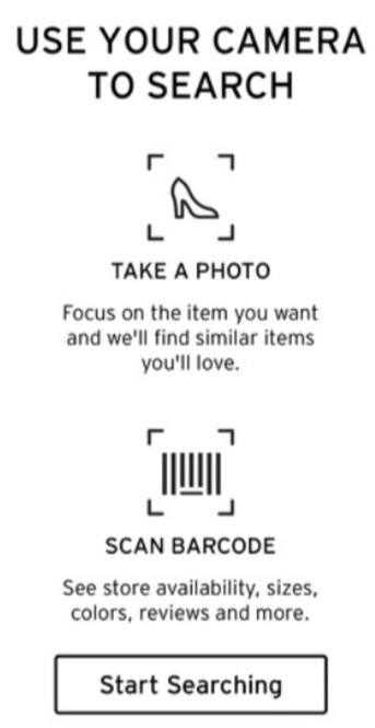 Cross-selling at its finest. See shoes you like? Take a picture and find similar items you may also like.
Users can browse, shop, and purchase all within the app.
With all that said, something is working for Nordstrom.
While other department stores taking a downturn (retail insiders point to Amazon’s dominance), Nordstrom’s sales last year were at a record high of $14.1 billion, up 35% since 2011.
1-800-Flowers
Just from the company’s name, you can tell that 1-800-Flowers started off in a simpler consumer world, compared to our mobile-dominated reality of today. However, from the get-go they were early adopters of the newest technology of the time; they were one of the first retailers to use a toll-free retail phone number for direct sales, and subsequently online. And as early as 2009, they were doing e-commerce on Facebook (where they were one of the earliest adopters).
The company’s classic relationship marketing has always been paired with the latest technology. From their founding, 1-800-Flowers has relied on word of mouth recommendations and a stellar reputation with consumers while simultaneously pushing the boundaries by adopting the latest technology of the time. Jim McCann, the company’s founder, discusses personal relationships with customers as key to their marketing and business strategy: “It is critical for us to create and maintain a much deeper, engaged, and trusting relationship with the customer.”
They are known for innovating in order to make it easier and more fruitful for the customer to get what they need. They have consistently been an early adopter in the realm of e-commerce and marketing technology in order to make the customer journey easier, through channels like Facebook, their own website and integrations with other e-commerce platforms.
Let’s see how they’re doing it.
E-Commerce on Facebook
Back in 2009, 1-800-Flowers set up an e-commerce store on their Facebook page, way before anyone was doing it.
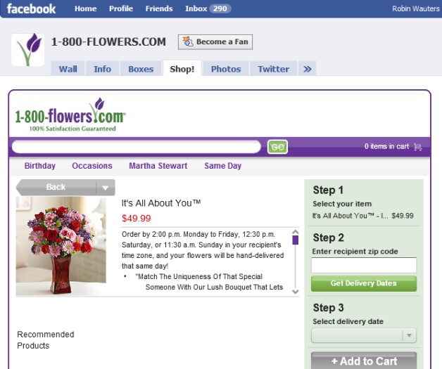
Image Source
Now, the brand’s strategy to attract a younger generation on mobile and social is working very well. Their reasonable price points also contribute to this fact.
Since April of this year, 1-800-Flowers has a Facebook chatbot that can handle full transactions. They were one of the first two retailers to launch a chatbot on Facebook. Mark Zuckerberg even used 1-800-Flowers as an example when demonstrating how the chatbots work, during the 2016 F8 conference.
Website
The 1-800-Flowers.com website is detailed, thorough and makes the customer journey very simple by offering themed arrangements sorted by occasion (i.e., Christmas, Birthday, Sympathy, etc.).
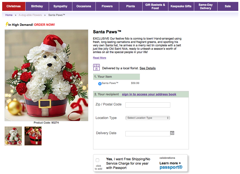
They also offer a special membership called “Celebrations Passport,” similar to “Amazon Prime” where the customer pays a set price per year and receives free shipping and a waived service charge on orders.
Integrations
Besides their Facebook chatbot, 1-800-Flowers has two other AI tools: integration with Amazon’s Alexa and IBM Watson’s concierge service, which have attracted over 10,000 users, most of them new — and young.
Amazon Alexa
1-800-Flowers got in on the Internet-of-Things action with their integration with Amazon’s Alexa, the voice-enabled personal assistant. Customers can order flowers and gifts through their mobile devices or on Amazon’s Echo (their smart speaker) by saying, “Alexa, ask 1-800-Flowers to send flowers to Mom before Christmas.” For this to happen, the customer must have a registered 1-800-Flowers account and provide the shipping and payment details beforehand.
IBM Watson
The flower brand launched a digital “concierge” service called GWYN (Gifts When You Need), right before Mother’s Day earlier this year. IBM’s Watson, an AI agent that uses machine learning to help consumers choose the perfect gift for someone, powers the service. The service is available on desktop and mobile.
It works by the customer typing something into GYWN to start the process, like, “I want to buy a birthday gift.” GYWN will then ask the customer follow-up questions to narrow down the search, such as “Is it for a female or a male? Age 25 or 30?” The more data GWYN collects over time, she becomes “smarter” and will be able to present better options to customers in the future.
Marketing software
1-800 Flowers are now using advanced martech platform Optimove, who recently announced a CRM optimization bot to help companies target their current customers better. This predictive analytics technology is key for the brand’s successful customer retention strategy. 1-800-Flowers uses this technology to present personalized deals and offers to their current customer base throughout multiple channels.
Sephora
Sephora is an innovative beauty brand that uses creativity and technology to connect with customers, while utilizing traditional marketing to stay grounded.
Sephora is popular with consumers via word of mouth recommendations — how much more old school can you get than that? Their rewards program is well-known for imbuing a traditional marketing strategy — a loyalty program — with life and personality. The program has three levels of membership based on the amount a customer purchases per year as well as a newly-introduced “Beauty Bazaar” with rewards twice per week. Rewards can range from regular beauty products to a makeover, to something over-the-top as a makeup class at Anastasia Beverly Hills.
Sephora has a cutting-edge branded app with highly interactive features, focusing on a fun and rich user experience. One Augmented Reality (AR) based feature is the “Product Try-On” (see below) where users can virtually try on beauty products like lipstick and eyelashes, to see what they would actually look like on their faces. They can then purchase the item from the app — pretty smart, right?
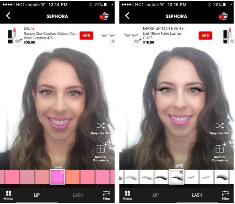
Sephora’s “Product Try-On” feature
Social Media
Sephora is winning at cross-channel social media. Here’s how.
Hashtags
The beauty brand has a popular hashtag that they use, #TrendingAtSephora, to market and connect with customers, even on different platforms. The tweet below highlights how the brand uses one channel — Twitter — to get traffic in another channel — Facebook — for a Facebook Live tutorial.
Facebook chatbot
Sephora recently unveiled a Facebook bot that allows customers to book consultations or in-store makeovers.
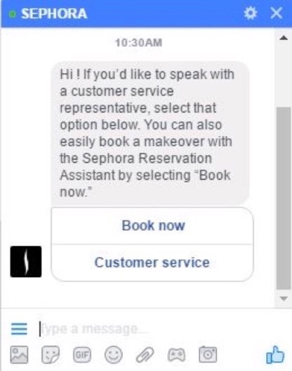
The brand also just announced they will be rewarding customers with gift cards directly on social media through a partnership with CashStar, a prepaid commerce solution. This can be useful for customer brand ambassadors and customers who’ve had customer service issues.
Sephora’s mix of classic and trailblazing marketing techniques are their forte, which translates into branding success.
Find the Balance
Nordstrom, 1-800 Flowers and Sephora have done what most brands fail to do: combine time-honored marketing approaches with modern martech to ensure relevancy and a competitive edge while being respected in their industries and by consumers.
Starting with the traditional value of putting exemplary customer experience number one, while simultaneously extending their digital reach with cutting-edge e-commerce, branded apps and advanced marketing technologies, these brands find and maintain the balance. By learning from these top-tier companies on how to pair traditional marketing with new martech, companies can grow with the times while staying grounded — a feat that is challenging, yet possible.
About the Author: Shayna Smilovitz is a writer living in Tel Aviv, originally from the San Francisco Bay Area. She loves writing about the intersection between marketing, technology and culture. You can follow her on Twitter.

source
https://blog.kissmetrics.com/old-school-with-new-marketing/
 An Illinois law is proving a thorn in Facebook’s side as a class action lawsuit, alleging mishandling of biometric information, moves towards trial. The latest developments in the case have the social network objecting against releasing or even admitting the existence of all manner of data, but the plaintiffs aren’t taking “objection” for an answer. Read More
 The NFL is hoping to expand its presence in China with a new deal that gives social media platform, Sina Weibo – often called China’s Twitter – the rights to live stream select games on its network, including the Super Bowl. The deal marks the first time a sports league will live stream games on the service, the NFL says. Additionally, Sina will gain the rights to…
  Twitter is taking another step into getting into live video by introducing 360-degree live streams through Periscope. Anyone on Twitter and Periscope can watch 360-degree live video, though currently only select partners can go live in 360 via Periscope, the company announced in a blog post. While it’s only available for a limited number of partners for now, it makes sense that Twitter…

 The direction you look could one day control your VR or mobile experience thanks to Facebook and Oculus’ latest buy, The Eye Tribe. Oculus confirms to me that this is an official acquisition.The startup has developed a $99 eye tracking device developer kits for computers, and software that can bring gaze-based interfaces to smartphones and potentially virtual reality headsets. Basic…
  Egypt has intensified its cyber crackdown under president Abdel Fattah el-Sisi. In recent years authorities have blocked Facebook’s controversial Free Basics program for not allowing it to spy on users, imprisoned citizens for satirical Facebook posts and reportedly used Deep Packet Inspection technology allowing for extensive surveillance of Egyptians’ online activities.
  Snapchat sewed up its first acquisition in Israel this week, according to the outlet Calcalist News. It acquired four-year-old Cimagine, whose augmented reality platform lets consumers instantly visualize products they want to buy in their intended location, paying what Calcalist says was between $30 million and $40 million. According to its LinkedIn page, Cimagine currently works with brands…
  Snapchat wants you to play with your face, not just take pictures of it. New Selfie Lens filter games are starting to appear to users, creating an addicting new Snapchat feature that also inspires competition between friends and could become a powerful ad revenue driver. Snapchat confirms this is the launch of a new, native games feature. Back in March, Snapchat tested a limited run of a…
  Now it’s Twitter copying Facebook…but in the worst way. Following several embarrassing disclosures of inaccurate metrics by Facebook, today Business Insider’s Alex Heath broke news that Twitter overcharged some advertisers. Between November 7th and December 12th, a source tells BI that video ad buyers were overcharged up to 35%. Twitter apparently informed these…
  Nearby Friends didn’t turn into the Foursquare-killer it could have been, but Facebook is still trying to help people meet up in person…with a few changes. Facebook has removed the precise location sharing feature from Nearby Friends, which now only lets you opt-in to broadcasting your approximate distance from friends and current neighborhood. Unmapped Previously, you could select…
  Layoffs, a borked acquisition and continued tepid user growth defined Twitter in 2016. And these are all things that make Twitter’s future uncertain, which we know Wall Street does not like. Jack Dorsey’s one-year tenure as CEO was more or less defined by a continue decline in its stock price and, amid all its attempts to try and re-make the service and make it more palatable,…
  Mark Zuckerberg gave new insights about how he sees Facebook’s role in informing the world today during a Live video one-on-one year-end chat with COO Sheryl Sandberg. Facebook’s CEO also lent support to employees trying to fight fake news today, though reports indicated some employees with dissatisfied by his initially tepid response to the issue. “Facebook is a new kind…


 Facebook is turning its public figures-only Mentions app into a handheld video studio with a slew of new Live broadcasting features rolling out the next few weeks. Mentions on iOS and Android will let broadcasters control brightness and mirroring through an adjustments tray, add category tags, set up comment blocklists, trim their video replays, and see their audio, battery, and…
  Facebook’s shadowy Building 8 research team needs help from academia to invent futuristic hardware. But today’s pace of innovation doesn’t allow for the standard 9-12 month turnaround time it takes universities to strike one-off research partnerships with private companies. Enter SARA, aka Facebook’s “Sponsored Academic Research Agreement”. It’s a…
  Facebook released its latest transparency report today, detailing government requests for user data for the first half of 2016. According to the report, government requests for account data increased by 27 percent globally as compared with the last half of 2015. The number of requests grew from 46,710 to 59,229, Facebook said. The majority of the requests (56%) received from U.S. law…