No, this headline isn’t clickbait.
This article does contain critical homepage elements that are often overlooked. And you might be ignoring them. In fact, the examples I share here are a sure sign that many marketers still ignore critical homepage elements. And conversions are lost for these simple reasons.
I’m not going to rehash what you already know about homepages.
You are a smart marketer. You already know a homepage is your website’s front door. It’s where most of your customers expect to find the #1 thing you do that can solve a specific problem for them.
Okay, enough talk. Here are six homepage elements you’re probably overlooking that are costing you conversions:
1. Homework (a.k.a. doing customer research)
Homework ‘on people’, that is. And yes, it’s a homepage element—because it shows when you do it well.
Imagine this for a second: Your high school teacher assigns you homework and asks you to submit it in three days. For the next two days, you stay up late and wake up early to deliver your best. You faithfully turn in your homework on the third day.
Question: How long would it take your teacher to score your work? A few seconds to five minutes. That’s how long it will take to score something you worked on for days.
It’s the same with your homepage. Your homepage (or even any landing page for that matter) is like homework given to you by your target audience. It takes them a few seconds or minutes to score you, before deciding to bounce or stay.
Homework shows on your homepage—because, if you do it, your copy will be saying what your prospects want to hear. If they land on your page and find that you’re not speaking their language, it shows you haven’t done your homework, and things can get ugly. You may even leave such a bad impression that they make a point of not going back.
Example, Ashdown People—a firm specializing in HR for IT businesses:

If you’re a tech firm who visits this page for the first time, here are a couple of questions you’d naturally have in mind:
- What does Shaping The Digital And Technology Workforce mean?
- How are you shaping it?
- What’s the exact HR problem that this brand solves for IT organizations?
The page looks nice, but imagine the confusion its visitors may be experiencing.
In contrast, take Solertia — another HR firm:
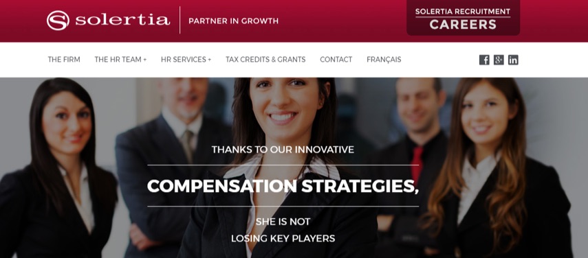
Their homepage copy speaks directly to a specific challenge folks running HRs face—developing compensation strategies to avoid losing key talent. This will catch the attention of an HR pro because it deals with problems that hurt and offers a solution.
This is a good example of someone doing their homework. Whoever wrote this copy studied their audience well enough to find that ‘developing strategies to keep key players in an organization’ is a goal HR departments always try to reach.
Doing your homework on your target audience reflects in your messaging.
How do you do your homework? Talk to the very people that visit your homepage: customers. In other words, get feedback. There are great tools that will help you here, some of which include:
- SurveyMonkey: Create surveys and generate quality feedback.
- Kampyle: Get feedback from users.
- Get Satisfaction: Build a forum where customers talk to one another about your product, while you just watch, listen and act accordingly.
- AnyMeeting: Schedule live meetings with customers and get actual feedback from them.
- IdeaScale: Allows users to make and vote suggestions about your product. And feedback with the most interactions gains higher recognition than others.
These tools will help you know your customers’ pain points, goals and how they will need your product to solve their problem. Then, you’ll be able to create a homepage (and even any other landing page) that speaks directly to those problems.
Next, brevity and clarity.
2. Brevity and Clarity
Brevity doesn’t necessarily mean copy is short. It does imply there are no redundancies, and yet enough clever repetition to convince visitors to take a specific action.
Chris Garrett, Chief Digital Officer at Rainmaker Digital, wrote that a landing page should be, “as long as necessary. And no longer.”
That’s brevity. As long as necessary. No longer. And clarity, on the other hand, is self explanatory enough. Is the problem you solve for your audience crystal clear?
When your homepage doesn’t briefly and clearly explain your offerings, people lose interest. It’s that simple.
Another case in point is where you have brevity on your homepage, but not clarity—a case where your homepage copy is brief, but it isn’t clear how visitors will benefit from your business.
A typical example of that is ZOHO’s homepage:

It’s a well-designed page and it sure is brief, not much to read here. But to me, it lacks clarity.
If, like me, you knew nothing about ZOHO before visiting their homepage, you have no idea what The operating system for your business OR A revolutionary all-in-one suite to run your entire business means. If you’re curious, though, you might want to click the “learn more” link to find out.
But according to some sites, Zoho gets about 18 million monthly visits. What if 400k, 1mm, 5mm … of those monthly visitors aren’t curious enough to click learn more? They were probably looking for a specific solution before landing on this page, and that’s what they expect you to communicate to them.
Your best bet is to communicate whatever you’re offering in the clearest and shortest way possible. A perfect example of “brief and clear” is Google My Business’ homepage:
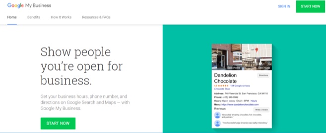
In just over 20 words, with an image on the side, Google My Business clearly and briefly explains how they help your business get found when your brand name is searched.
So brevity and clarity could mean five, ten, 200 words. What matters is that your page provides enough information for your visitors to become convinced and take action. And this why not hiring a good copywriter for your business is a terrible idea. A good copywriter will do enough dirty work to produce copy that has both brevity and clarity.
3. Active voice on CTA Buttons
(Active voice describes a sentence where the subject performs the action stated by the verb.)
In other words, a CTA button with active voice is one that says, “This is what will happen when you (the visitor) click this.”
And active voice goes beyond just using verbs on your CTA.
It’s easy to think that all visitors understand what a colored CTA button means, but you’d be surprised. Sign-Up.to recently mentioned in their study that “Images are good, but it’s not always clear that the image is also a call to action.”
Just because you have a colored button on copy doesn’t mean visitors know where the button will lead when clicked. Example:

Where will Click Here lead when clicked? Is that button for a call, an email, or a link to another page? You need to let people be certain what your button is for, or you risk confusing people.
Here’s a perfect example of that from Toyota:
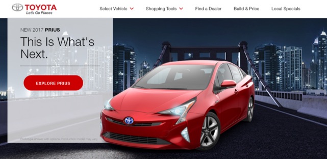
“Explore Prius” is active voice. It says exactly where the CTA will lead after it’s clicked—a page where you get to explore the Toyota Prius.
That’s active voice in action. Don’t put your visitors in a position where they’re not sure what your button is meant for. Make it as descriptive as it needs to be — Explore [my product], See a demo, Check out this case study, etc.
4. Specificity Over Hyperbole
Why not hyperbole? Because overstating can lead to visitors questioning your sincerity.
Instead, use copy that specifically communicates how you actually add value to people’s life and businesses. Twilio’s homepage is a good example:
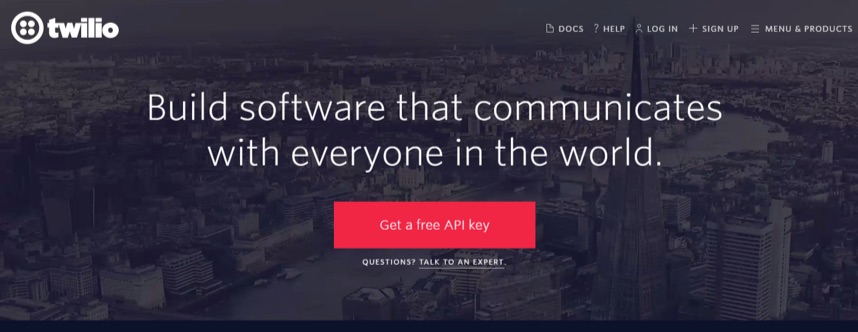
Twilio is a tool that software developers use to add communication capabilities to the applications they build. And that’s exactly what they explain in the homepage: “Build software that communicates with everyone in the world.”
No overstatements. No hyperbole. Just the specific problem Twilio solves for people.
Hootsuite’s homepage is another good example:
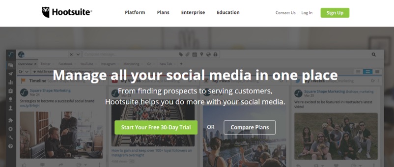
According to SEMrush, Hootsuite gets about 7.2 million monthly visits. That’s impressive; yet, there’s no mention of how big they are on the homepage, but a brief and clear explanation of how their product solves problems for people.
Adding hyperbole to your copy doesn’t communicate any value. ConversionXL Founder Peep Laja says it this way (54:21): “You don’t add life to copy with hyperbole. [For example,] ‘We have the best pizza in town VS. We deliver pizza in 10 minutes’. [Pick] specific [over] hyperbole”.
5. Testimonials With Smiling or Happy Faces
Testimonials are powerful already, but one with a smiling face pictured? Terrific!
One Swedish study reveals that your smile has a huge effect on people around you — try smiling at someone and you’d see they almost couldn’t help but smile back, unless they consciously don’t want to. Amazing, eh?
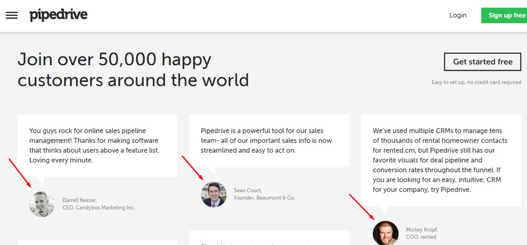
Pipedrive laid emphasis on the fact that their customers are actually happy people. Then they put those happy, smiling faces about 40% down their homepage.
Kissmetrics understands this concept as well:
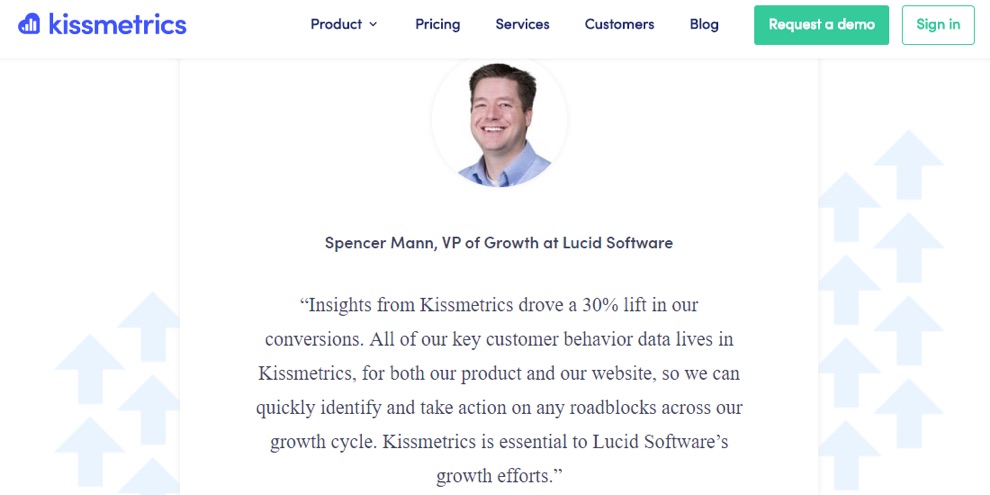
So, if you’re going to use testimonials with customer headshots, use those that are smiling already since they have a positive effect on viewers.
6. One Page, One Goal
You’d think every marketer by now gets the concept of one page, one goal, until you see a homepage like this in 2017:
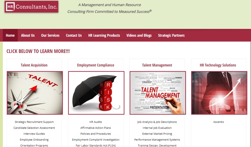
Several CTAs on one page. What’s the one goal that a page like this is trying to achieve? Virtually everyone would have no idea. And several studies have proved it’s far better to use one page for one result. The more specific you are, the better you’ll be at converting specific visitors.
A good example of a homepage with one goal is this one on QX Recruitment Services:
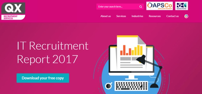
In contrast to HR Consultants homepage (above), this one has only one goal. Which means if the homepage gets 2000, 5000, 20000, etc. monthly visitors, this report will be the number one thing catching their attention. And it’s the only action they’re first asked to take. Brilliant.
This way, QX Recruitment Services know how to measure the homepage’s success — it’s as successful as the number of downloads the report gets.
Start Converting With Your Homepage
If you’re going to have a homepage (or even any landing page) at all, you want to ensure it drives optimal conversions. And the tips above have hopefully inspired you to make specific corrections on your homepage, or even create a compelling one from scratch.
About the Author: Victor Ijidola is a conversion-driven freelance writer and content marketer. Need help with landing pages, ebooks, blog posts, guest blogging, email newsletters, etc? Contact him at Premium Content Shop.

source
https://blog.kissmetrics.com/homepages-rarely-convert/



 As Rafiki once said, “It is time.” Tinder Gold, the dating app’s new premium subscription tier (which includes a feature that lets you see who’s already liked you without any swiping) is finally rolling out to the U.S. Tinder Gold and Likes You were originally tested in Argentina, Australia, Canada and Mexico at the end of June. Today, however, the the feature rolls out…


 Facebook says it’s taking another step against Pages that share fabricated news stories. The company has already been working with outside fact-checkers like Snopes and the AP to flag inaccurate news stories. (These aren’t supposed to be stories that are disputed for reasons of opinion or partisanship, but rather outright hoaxes and lies.) It also says that when a story is marked…
 Turns out, observing other people’s lives is actually a biological instinct. And in the age of social media, where lives are presented on a platter and require only the slip of a thumb, it’s easy to indulge in those instincts. In fact, sometimes, we let our impulses run wild in the most unproductive ways. But why the fascination? Whether we social media stalk out of adoration…