A part of using analytics is knowing what user behavior is driving what action. Most tools only give you surface-level data. For example, you’re aware that signups decreased last week, but you won’t know which segments are behind any trends in your KPIs. And that makes it pretty useless.
Activity Report is our approach to solving this. With this report, you’ll look at specific events (say, user signups) over a period of time (week, month, etc) and then drill down to see what’s driving the trends. This helps you understand the “why” behind any meaningful trends.
Let’s see how this report works.
Product Marketers: See Which User Segments Are Driving Product Adoption
As product marketers, we’ll want to make sure our users are using product features, new and old, and staying engaged with the product. We can track this engagement and what’s driving it in the Activity Report.
You can set up an event to trigger anytime someone users a feature in your product. For simplicity in this post, we’ll have an event that triggers when someone uses feature “A”. We’ll set the date range to the last 30 days.
793 people have used the feature in the last 30 days. We see our usual dips that occur during the weekends, but quickly recover on Mondays.
To see who is using this feature, we’ll drill down by selecting account status. This will show us how many are current, paying users and how many are trial users.
This shows us very clearly that the bulk of people using this feature are paying users. Our trial users are significantly fewer, and they use it less times than our paying users. Our free users have low engagement, about 2 times per person, far fewer than the 18 and 25 we have for paying and trial users.
Let’s look at the plan tier for our paying users. This will help us answer the question – are our enterprise users using the app more? Or is it the small or medium users?
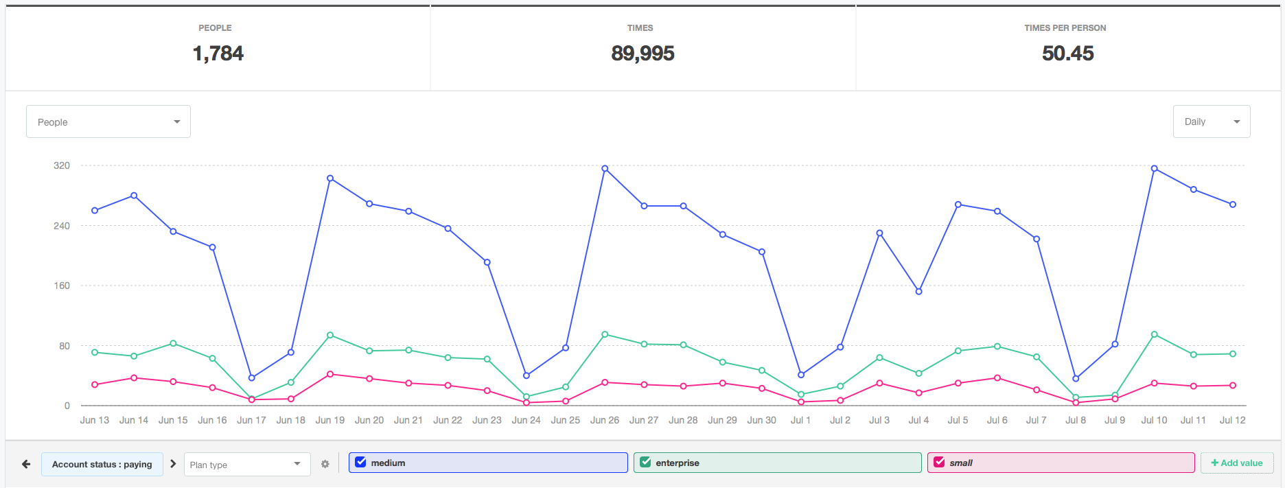

This shows us that users on the medium plan type are the ones who are, by far, using this feature the most. They’re driving the engagement, or lack thereof, of the feature.
So now that we know this, what’s the next step? What can we do with this information?
We know the user behavior – our enterprise and small customers aren’t engaging with this feature as much as we’d like. Wouldn’t it be nice to send an email to these users to get them familiar with the feature and to give it a try?
Good news – we can do this quite easily. And we won’t have to leave Kissmetrics to do it.
With Kissmetrics Campaigns, we can send email messages to anyone in our user base. We’ll simply set the criteria for the users in the small and enterprise plan who haven’t used the feature and send them a message giving the background on this feature and the primary benefits.
Marketers: Understand What’s Influencing Signups
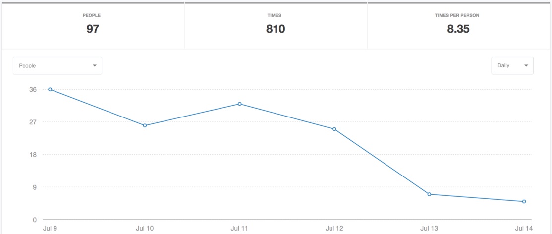
You sit down on Friday afternoon to write your weekly report, and pull up the Activity Report to see that signups have been plummeting all week.
We went from 36 signups on Sunday down to just 7 on Thursday.
What’s causing this drop? Let’s drill down to see.
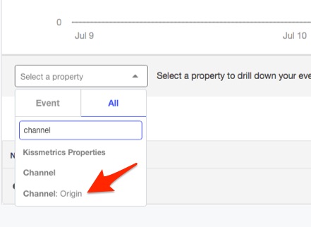
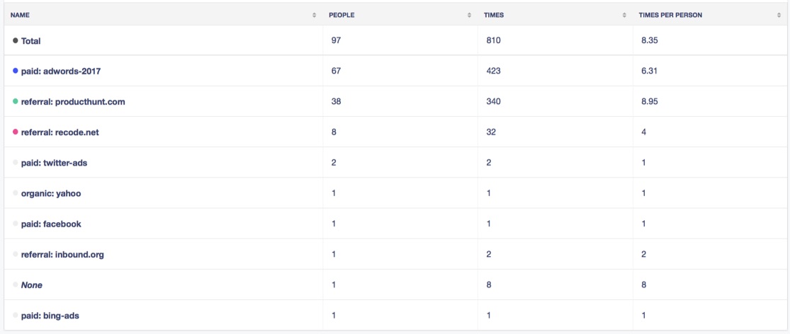
We’ve been running a lot of ad campaigns lately, so let’s split these signups by marketing channel : origin. This will show us the original marketing channel they come from (ie organic, paid, social, etc) and then origin will display the referring URL or the Campaign Name that was used in the UTM parameter.
Here’s where our customers are coming from:
To visualize this data, we’ll scroll up to the graph:
We can see what’s driving the slump in signups. The blue line, representing our adwords traffic, is almost perfectly correlated with our drop in signups for all channels. Now we know the channel that’s causing the drop, but to investigate further, let’s drill down into our adwords channel to see what ads are specifically leading the drop.
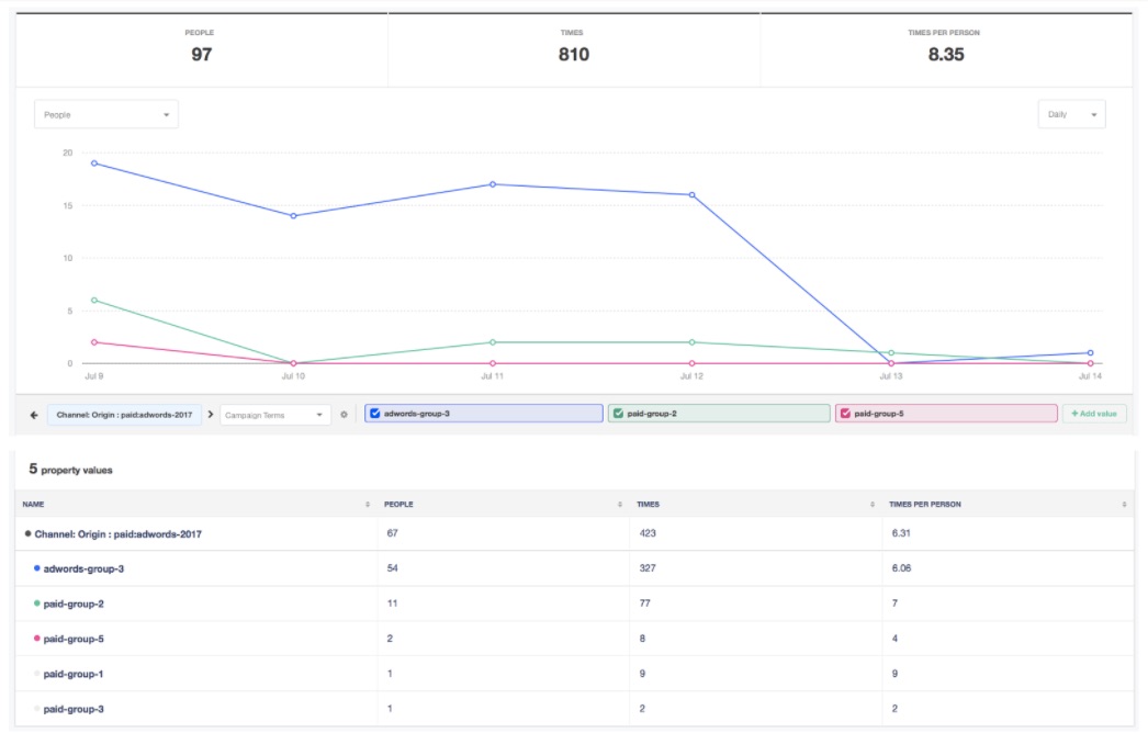
We’ll select the UTM Campaign Terms to see which ad group is responsible for the drop.
And we have our answer. Adwords-group-3 is the primary driver of the poor performance. We’ll have to turn this ad group and create new ads that convert better.
So to recap – we saw our signups plummet in one week, we drilled down by the marketing channel, and the origin. We saw that AdWords was responsible for the drop, but because we have multiple ad groups we didn’t know which segment was responsible. So we drilled another level down into Campaign Terms and got our answer. And we did this all with a single report, and we got the insight in a couple minutes.
Growth Teams: See Which Segments Are Outperforming and Underperforming in A/B Tests
Growth teams rely on constant experimentation and learning to drive growth for their companies.
What we’ll do here is look at a conversion event, signed up, then drill down into which a/b test they were in, then see what referrer they originated from.
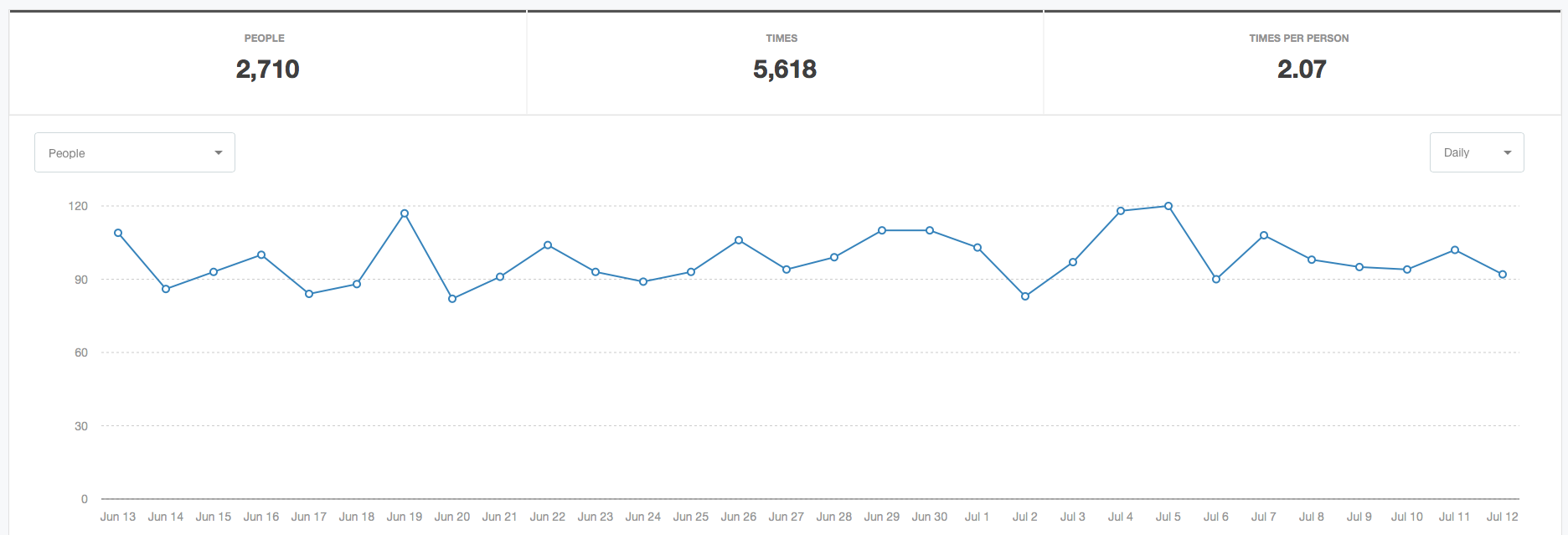
So we’ll select our event, signed up and see how it’s performed over the last 30 days:
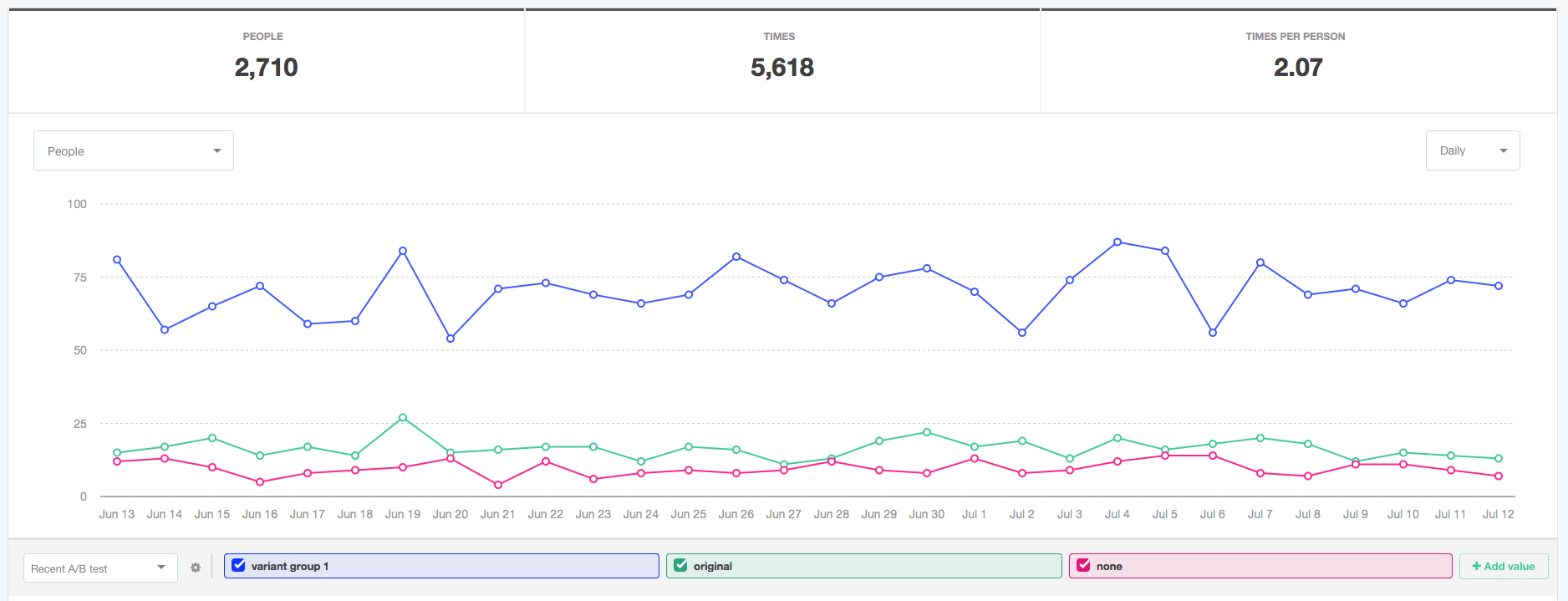
Looks like it’s holding steady. Now let’s drill down to our recent a/b test and view the variants in this group:
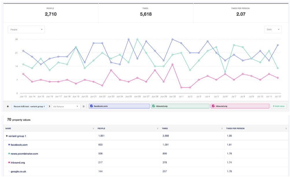
Wow – it looks like variant group 1 received significantly more signups than original and the people that weren’t in the a/b test. Let’s look further at our winning variation by seeing who referred them to our site:
We have 70 different referrers, but let’s focus on the top 3.
Looks like our social media mentions and views on Hacker News and Inbound received the most views and brought the targeted traffic that ended up converting to signing up.
What can we learn from this? Our traffic coming from these sources is targeted towards the right audience that is interested in our product. We should to get more traffic coming from these channels.
While we can’t advertise on Hacker News or Inbound, we can on Facebook and other places where our audience frequently visits. To get on Hacker News, Inbound, and other places we’ll have to release features that capture that audience’s attention or write influential, thought-provoking pieces that are worth sharing. Easier said than done, but now we know what brings qualified traffic.
Conclusion
Often times in analytics you’ll need to drill down to see exactly what’s driving what. That’s what Activity Report does. Pick a KPI, and drill down to see what’s driving the growth or contraction. Request a demo to see how it will work for your company.
source https://blog.kissmetrics.com/kissmetrics-activity-report/



No comments:
Post a Comment