The marketing industry leads the way.
Sure, other industries (eventually) catch on to sophisticated marketing techniques.
But more often than not, it’s the digital marketing echo chamber that paves the way for strategies and tactics before they hit mainstream.
For instance.
Consumers today ignore ads. They’re banner blind and doubling-down on ad blocking. As a result, we (ingenious) marketers have devised a plethora of new ways to interrupt, call attention, and generally annoy the S- out of people in order to get them to pay attention to what we’re pitching.
Here’s the thing though.
Some people might complain. They might not love it. But at the end of the day, they get results. And that’s what we get paid to deliver.
So whether we like it or not, here are three ‘spammy’ website tricks that can skyrocket your conversions.
Spammy Tactic #1. Countdown Timers
There were two groups of people.
Each received a cookie jar full of cookies. But the first received 10, while the second only received two.
Everything else was the same. Same jar. Same cookies.
But the group that only received two rated theirs higher than the one who received 10.
In other words, the limited supply introduced scarcity: the sixth of Cialdini’s original principles.
When there’s no fear of missing out (on a great deal, or on a limited supply), we don’t act. There’s no urgency that propels us through the epic battle that is inertia.
That’s why: Black Friday. And every other “limited-time only” sale (that happens at least once a month).
The savviest marketers understand this and even sell online accordingly. For example, go try to buy one of Ramit’s ‘flagship’ programs. You can’t. Enrollment is limited to certain periods of the year, with finite beginning and ending periods, so you can’t just hem and haw forever. (That’s how Work the System finally got me, too.)
It’s available. Or it’s not. So you better take action if you’re even remotely interested.
The best tactical example of that today is the countdown timer. You see that little number clicking down and your lizard brain goes into a panic. FOMO strikes. You gotta take action now before it’s too late.
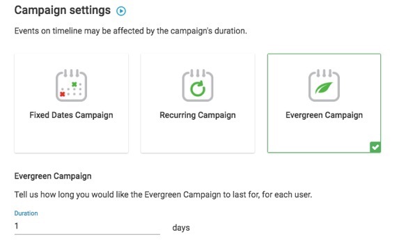
For example, Thrive’s Ultimatum WordPress plugin helps you instantly add countdown timers to a site for specific campaigns, recurring events, and even ‘evergreen’ campaigns that don’t expire (more on that in the next section below).
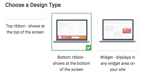
Next your goal is to display that countdown timer to any-and-all appropriate site visitors. That could be in the form of a simple ribbon across the top or bottom of your screen. Or the classic sidebar-widget area.
OR, if you’re especially clever, a little audible notification in the lower right-hand corner of your screen.
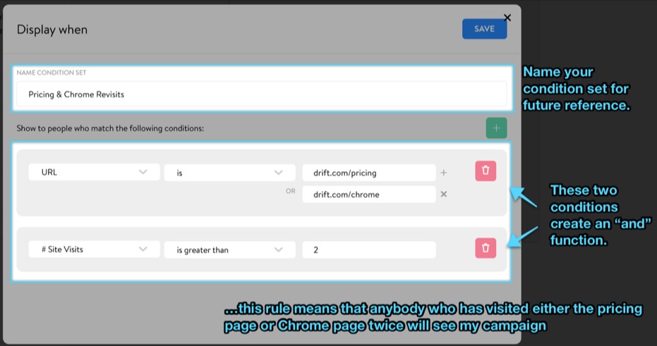
Drift is just one of many tools that allows you to display custom messages based on a number of segmenting criteria. For example, you can display a notification depending on how long someone’s been on your website. The number of times they’ve visited. Specific pages they have (or haven’t) touched. And even the percentage of the page they’ve scrolled down.
Wanna see this in action?
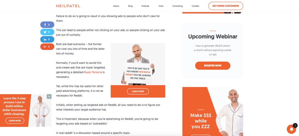
Go read a blog post on Neil’s site and you’ll see this:
No, not the left-hand corner slide out.
Not the frowny-face Neil in-line with the content.
Not the pajama-clad Neil in the sidebar either.
But that little tiny icon in the lower right-hand side of your screen. Sure it’s small. But apparently, size doesn’t matter (or so I’m told).
Because this little freaking thing will DING at you. A little audible noise to get your attention to click.
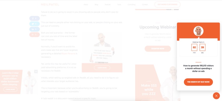
And when you do, you’ll see this:
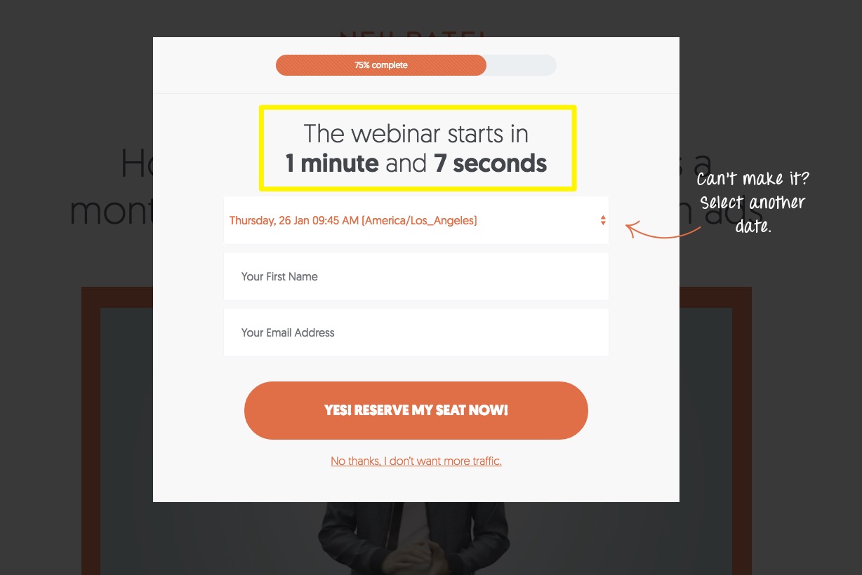
A little pop-up notification with a countdown timer. You’ve ignored all the other CTA’s so far. But THIS one has got your attention. Thanks, in large part, to that expiring offer that’s about to go away.
Better click on it…
And look at that! WOW – what good fortune! This webinar just so happens to be starting in the next ~ten minutes! I better signup, hit the restroom, and come back in time.
Brilliant timing on my part? Or is there something else at play…?
Spammy Tactic #2. Autopilot Webinars
Webinars are one of the best ways to generate B2B leads and sales.
Most marketers use them because they help decision makers make, well, decisions.
They give you the chance to connect directly with people and slowly-but-steadily flex your persuasion muscles at mass (#webinarswolfie).
But here’s the thing. The dirty little secret that no webinar-promotin’, info-peddling peeps tell you.
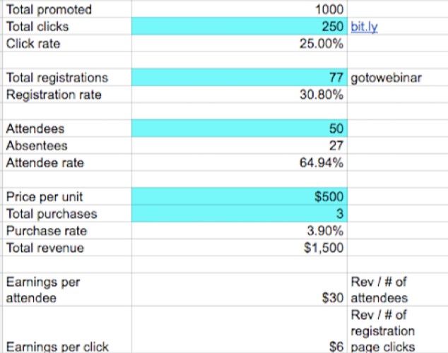
You’re gonna need MASSIVE reach for these suckers to make a dent. Here’s a hypothetical (but not too far off) example that illustrates this point:
First you gotta get people to see the message. Then register. Then actually attend (which often hovers around the depressingly sub 30% range). Then opt-in for a sales opportunity.
Your numbers drop off precipitously at each step of the way, until you’re only left with the tiny few who actually, possibly, might just buy something from you.
The trick is to then minimize any friction causing drop-off’s to maximize the amount of people who make it to each ‘next step’. (How’s that for some consultant-speak?)
One of the biggest drop-off points? Getting people to attend actually attend the webinar (from those who’ve registered). Back in the old days (so like a year or two ago in internet time), you promoted a webinar that was a week or two out and maybe delivered a few follow up reminder emails to make sure people didn’t forget about it.
But they did. And do.
The solution?
Give people instant gratification. Get them, right at the moment of signing up, to get the ‘payoff’ of being able to watch the information while they’re red hot.
Here’s how it works.
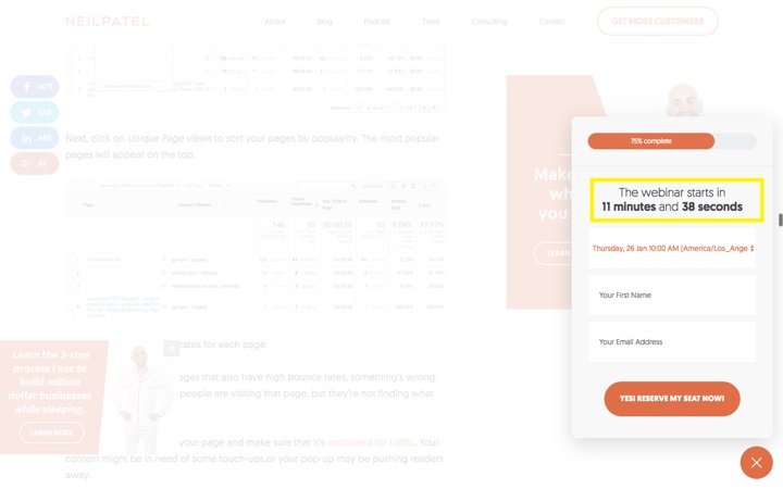
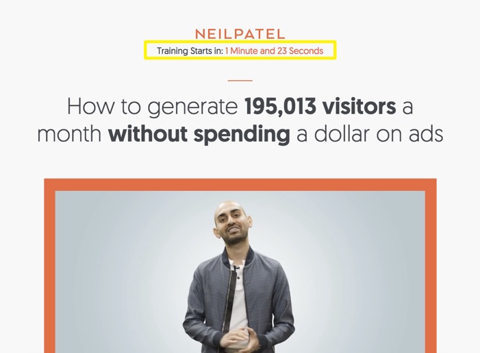
At 9:40am on January 26th, I visited the following website and landing page:
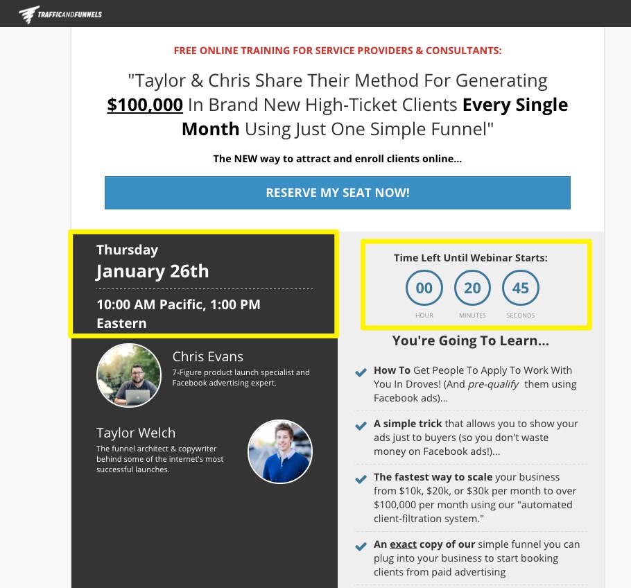
It’s no quinky dink that this webinar is starting a whole twenty minutes later at 10am on the same day.
Because if you visited the site today, you’d see pretty much the same exact thing. A new webinar starting the next hour, on the hour.
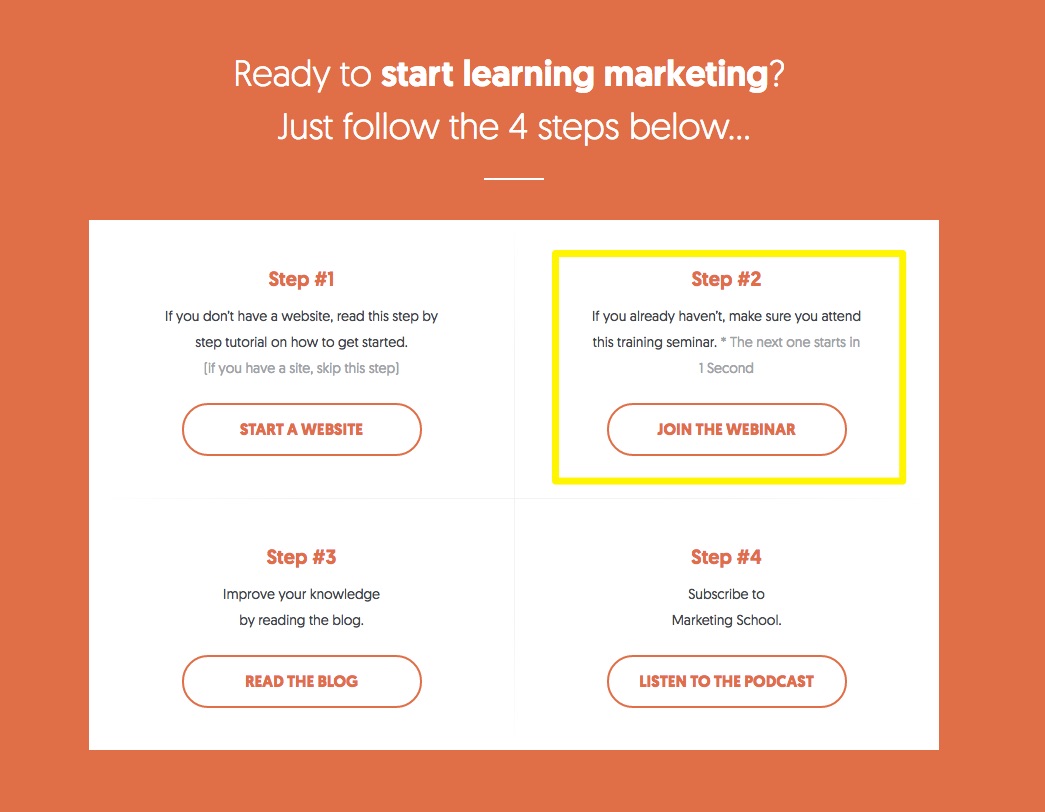
Let’s go back to Neil. His new homepage layout expertly incorporates this ‘exploding’ webinar offer several times throughout. Even in the supporting copy of his site.
Except his start every few minutes or so. That way, no matter when you visit, there’s a brand-new offer to convert. (Now! Before it’s too late!)
WebinarJam is one example that will let you run ‘live’ webinars on autopilot, so they can do all their customer-nurturing work at scale (without you manually executing).
The aforementioned Thrive Ultimatum has an ‘evergreen’ campaign option that lets you always-offer a campaign to new visitors.
But they also have a ‘lockdown’ feature that will restrict their access once-and-for-all (if you’re worried about it being too spammy). So even if they change devices, their own personal timer won’t reset.
Now we’ve got the lead-generating machine in place. The only thing left is to get people into it. Here’s how.
Spammy Tactic #3. Overlays
‘Reach’ and ‘Frequency’ are Advertising 101 concepts that’ve been around since the Golden Days of marketing.
Reach is the total number of unique people you reach. Frequency is the number of times you reach the same person.
Distributing your brand-spanking-new automated webinar offer through Twitter, Facebook, and Email might help your reach. But the majority of people simply won’t get the message (see: open rates and social half lives).
That’s where frequency comes in.
You need to show the same message, in a number of different ways, to the same people. Over and over.
If it takes 6-8 ‘touches’ to generate a sale, generating leads ain’t no different. Repetition is the best way to get more people into the top of your funnel.
Cue: The ‘Welcome Mat’, the screen takeover, the lightbox pop-up, or the ‘overlay’. Different names, but all the same thing at the end of the day with a single objection: putting a brick wall between a website visitor and their intended destination (so you can deliver a fast offer CTA).
These admittedly annoying tactics are pervasive… ‘cause they work!
AppSumo saw 3X the results when they originally used the Welcome Mat.
And their SumoMe customer data shows that the Welcome Mat reigns supreme in the race of let’s-see-how-irritating-we-can-be lead gen tactics.
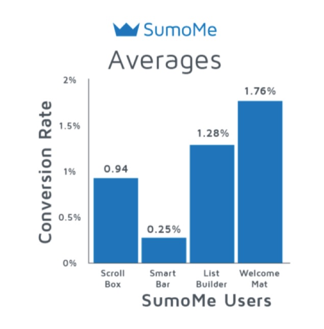
Welcome Mats are (generally) a temporary thing. They display for certain visitors but there’s a way to exit, click out, or bypass. But they don’t have to be.
Once again, Neil’s homepage features a ‘static’ welcome mat section that focuses a new visitor’s attention directly to an offer, complete with countdown timer and auto-play video. (Damn! How’d I forget to add that one to this list?!)
Here’s some more depressing news for you marketing purists out there.
“Websites with pop-ups consistently outperform websites with no pop-ups”, according to Crazy Egg.
By how much exactly? 2100% (!) via OptinMonster.
Compare that to the puny 0.4% typically seen from static sidebar CTA’s and you can see why ‘annoying’ is catching on.
Meanwhile, the best lightbox pop-ups can easily convert over 7%.
But how?
How do you create a best-in-class pop up that generates a unicorn-esque conversion rate?
By combining all of the things we’ve talked about so far.
Each of these ‘spammy’ website tricks, no matter how effective, are still just individual tactics at the end of the day.
The real ‘trick’ is to pull them all together to form one cohesive, holistic experience for the customer. A lightbox pop-up with an awesome offer (automated webinar) that’s expiring soon (countdown timer to create urgency) will always outperform another generic, scarcity-deficient “Get our Free Newsletter” offer.
“I’ve found the winning formula is a combination of a few tactics. My overall opt in rate is 5.5% with my ebook, welcome mat & list builder. I’m always testing to improve that,” according to Sujan Patel.
Conclusion
A full decade before ‘inbound marketing’ became a thing, Permission Marketing was published.
The concept “recognizes the new power of the best consumers to ignore marketing. It realizes that treating people with respect is the best way to earn their attention.”
But here’s the thing.
When you read the book – you know, actually crack the cover and read all the lines in between – you’ll notice that we (unfortunately) have to interrupt people to kick off the whole permission process in the first place.
People gotta see an ad. Or click on a Tweet. To get the ball rolling.
There’s no other way! We have no other choice. So almost any form of marketing promotion will be spammy at the end of the day.
What matters is how far you’re willing to push the envelope. And how you use it.
About the Author: Bra
source https://blog.kissmetrics.com/spammy-website-tricks/

No comments:
Post a Comment