Google Analytics is the de-facto industry standard analytics tool.
It’s installed on almost every single business site. (It’s even looked at too, sometimes, too.)
It provides a tremendous amount of data that you can manipulate, along with customization options for advanced features that power users crave.
Also, it’s free.
Google Analytics excels at providing surface level, top-of-the-funnel, aggregate data.
Here’s an example of where that comes in handy, along with a few problems it presents.
Where Google Analytics Excels
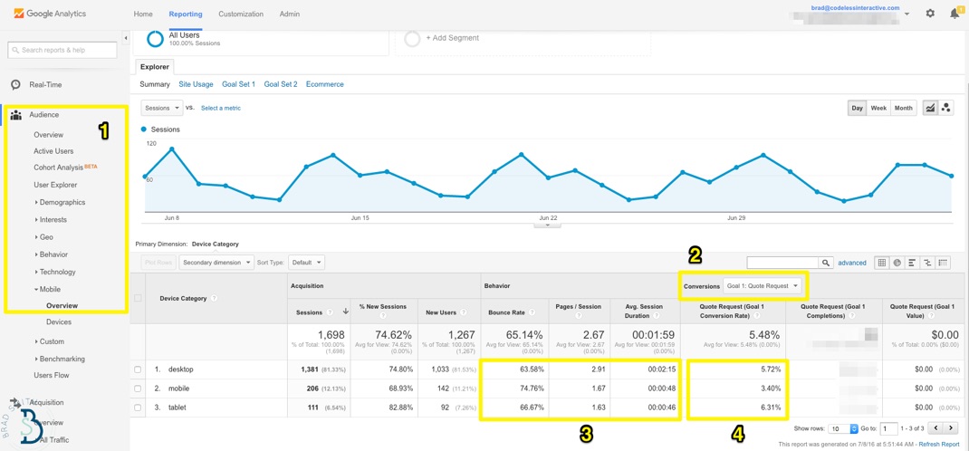
That super-duper-in-depth Quote Request forms works fine on your desktop. But what about for mobile and tablet users?
It’s a mobile world, and we’re just living in it. Not only are more searches done on mobile than desktop, but mobile usage in general (and growth) continue to eclipse desktop usage.
Today, the best sites are mobile-first from the ground-up, ridden of legacy issues like poor UX, IA, and speed that shackle conversions.
Like, for instance, long-ass forms.
With just a few keystrokes inside Google Analytics, your answer is waiting for you.
Easy.
While tablet conversions compare favorably to desktop, mobile suffers a bit.
You can extrapolate this further: pull up a basic spreadsheet and plug in the desktop conversion rate multiplied by your average lead value. Do the same for the lower mobile one. Hit enter. Find revenue or cost discrepancy.
Now you’ve got a cold, hard case to bring to your boss or client to fight for additional resources.
Google Analytics also does admirably with traffic channel source and page behavior.
For example, organic search will (generally speaking) be your top driver of traffic (whether that’s a deliberate strategy on your part or not).
Let’s take a quick look at which specific pages are performing best, so we can:
- Identify ways to improve them and get more people to convert from them.
- Reverse-engineer their success so we can start cranking out new content like them.
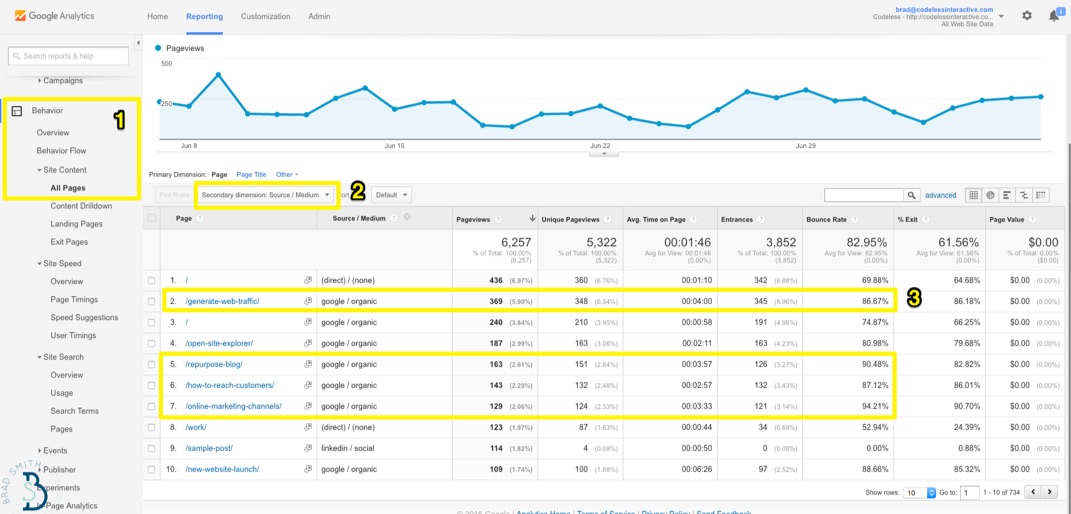
Again, if you know where the proverbial bodies are buried, you can pull up the most popular content on your site and add a ‘secondary dimension’ to highlight Source or Medium.
Awesome, a lot of older blog posts are performing well!
Perfect. Let’s make a few general notes of the topics that are performing well, and other ‘variable’ patterns they might have in common (like the images used, the category or style of content, the word count, etc., etc.).
But oh no, look at those bounce rates!
Maybe it’s time to reinvest in that old stuff and breath new life into it so we can better capitalize on all those search visits that are coming in.
They can probably use some new statistics and data as the world has evolved over the past few years. Today’s blog posts also tend to be more visual and step-by-step tactical, so let’s flesh out some of those high-level sections too.
With the help of a few basic Google Analytics reports, you can quickly spot high-level trends like this, and get decent reporting metrics on how your day-to-day tactical stuff (like blogging, tweeting, ads, etc.) are affecting new leads or purchases.
If you’re scrappy, you can even run some advanced tactics like split tests directly inside Google Analytics too.
However…
For all the good, there’s some bad.
There’s a few problem areas and obvious gaps where Google Analytics drops the ball. And you’re most likely going to need other software or tools to augment it in order to get the full picture.
(After all – Google Analytics is free. We can only complain so much.)
Here’s where Google Analytics struggles (and how to get around those problems).
Where Google Analytics Falls Short
Analytics for low-priced products are surprisingly cut-and-dry.
Extreme volume can always present a problem. But otherwise it’s a direct shot from A -> B. Point, click, and buy.
Google Analytics will show you product revenue in line with conversions, and you don’t always have to overthink what you’re looking at.
Consumers don’t overthink the process either, going from Stranger to Customer all in one fell swoop (or session).
Unfortunately, we can’t say the same for other organizations.
If you have a complex sales cycle, or a multi-step conversion process (like most SaaS apps) that go from Visits -> Free Trial -> Paying, you’re going to need to connect the dots.
And with Google Analytics, that sometimes feels more like you’re reading tea leaves as opposed to making data-driven decision.
Here’s why.
1. Attribution Problems & Last Touch Bias
Want quick, at-a-glance performance stats to draw surface-level conclusions? Open up GA.
However when it comes to tracking specific campaign performance (and comparing it to others), or looking further down the funnel at how leads are turning into prospects, sales opportunities, customers, and loyal promoters… it begins to get cumbersome.
Google Analytics is ‘session based’, looking mostly at individual visits. That means it can tell you what happens (more or less) during one visit. But if that visitor takes off, and comes back next week, there’s (mostly) no way to know that.
That brings about a whole host of attribution problems which can misinform your marketing decisions.
For example, let’s say you sell insurance. Here’s how that typical flow looks:
- Prospect gets a new, high paying job, just celebrated their one-year anniversary and has a baby on the way. Now they realize they should probably get some life insurance!
- So prospect begins doing general ‘unbranded’ searches for what type of coverage they might need and how much it’s going to cost.
- After becoming a little more informed, they start doing specific searches around individual products and vague terms (like ‘riders’).
- They read a few articles on a few different websites, and begin researching companies or brokers to reach out to (by typing in commercial keyphrases like, “life insurance quotes”).
- They click around on a few websites, and possibly opt-in to one or two to begin the sales process.
Ok, let’s stop for a minute.
There’s still a ton of stuff that needs to happen. The majority of those leads are never going to become a customer, but already there’s a few glaring problems.
Problem #1. Within Google Analytics, you can only see step 5. Not anything before that.
Problem #2. You take a gander at conversion sources, and you’re only seeing that commercial-keyphrase search done in step 4.
Confirmation bias. No duh – heavily commercial keyphrases are gonna convert well.
You can bid directly on those, but have you seen “life insurance” CPC ranges lately?!
And what happens, is that your company neglects or ignores all the other steps (specifically, 1-3) that lead up to this point, along with the marketing requirements it takes to deliver those things – like how your social media work increases reputation and credibility, how SEO for unbranded topics to increase brand awareness, how design and UX affects first impression, which conversion paths are most effective, and more.
Because you can’t see any of it! At least not in Google Analytics alone.
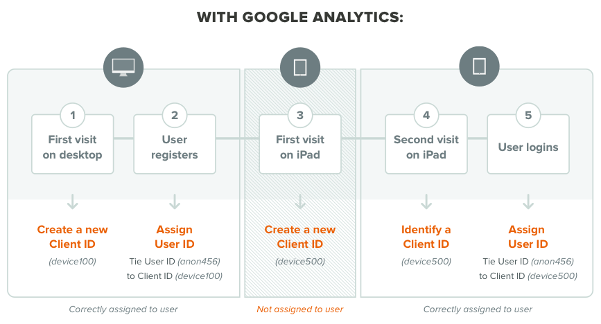
That’s where you need to layer in other tools to assign each user an individual ID and compile all of their visits (that sometimes happen over days or weeks) leading up to a lead opt-in or purchase.
TL;DR? Real-life is nuanced.
Google Analytics will show you that a conversion happened after a paid search.
BUT that visitor originally came to your website through an organic one. And then they came back because of a social one.
Those first two campaigns deserve a bit of credit, and any eventual share of the revenue that was generated as well (because the eventual paid conversion may not have happened without their assistance).
Another side benefit of this approach: you’ll get more accurate visits/sessions and pageview data as well.
For example, GA doesn’t combine one person’s site view’s and activity over several different devices or browsers – so you’re getting skewed, inaccurate information that could possibly be 2-5x more views than you’re actually getting.
2. Campaign Measurement Difficulties
Let’s revisit our hypothetical “life insurance” example to see where the next problem arises.
The ‘converting’ campaign was a paid search one for “life insurance quotes”.
If campaigns are tagged properly you can kinda track this work.
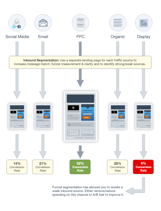
Another hack or workaround is Oli’s inbound traffic segmentation, where you create dedicated pages for each source or channel – even if they’re the same information – for measurement purposes).
But… an AdWords ‘campaign’ doesn’t = a larger promotional or advertising campaign.
A company-wide, revenue generating campaign involves multiple touchpoints and channels. Unlike offline, those channels help assist each other online (as we saw in the first step).
And our bosses (or clients) want to see how Campaign A compares with Campaign B across all marketing initiatives (not granular, leading indicators of the CPC from one term vs. another).
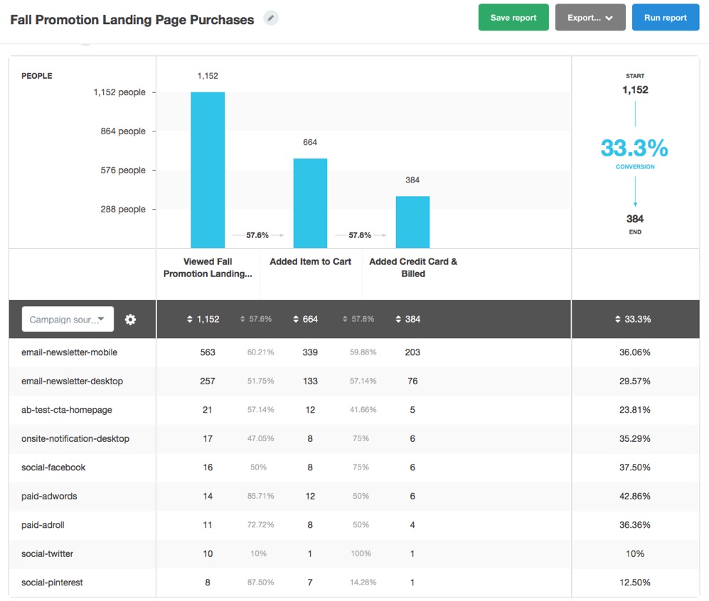
Thankfully, the recent updates to the new funnel report can help tremendously, picking up all of the various touch-points that contributed to your campaign’s success.
First, you want to create events that pick up all of your tracking codes and landing pages with that specific campaign variable.
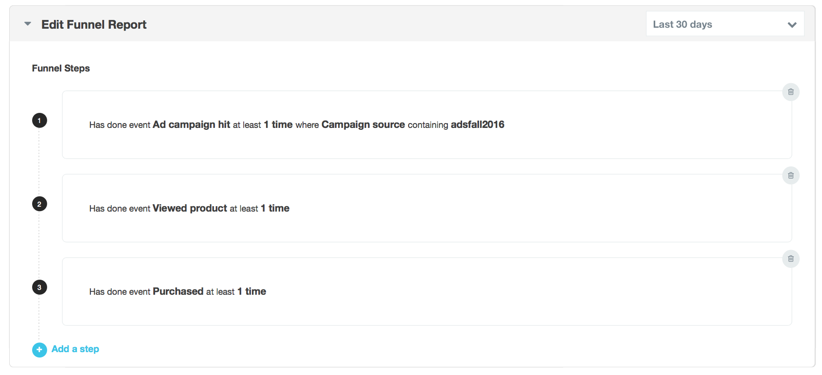
You can then also add the desired revenue-generating steps to see how the entire campaign – across channels – performed. And most importantly, you can compare this campaign’s success to other recent ones this year, or prior ones from previous years for context.
You can also dive deeper into these conversions paths, including multiple ‘variables’ along the way, like if there are two possible ways to ‘complete’ a single campaign.
For example, let’s say – like most companies – you have multiple ways for customers to contact you. There’s the dedicated landing page you spent so much time on, but many people will still click away from that page, browse around your site for a bit, click on your Contact Us page or call the number in your footer.
The Funnel Report allows you to assign both conditions, like both a Signup form and a Demo Page.
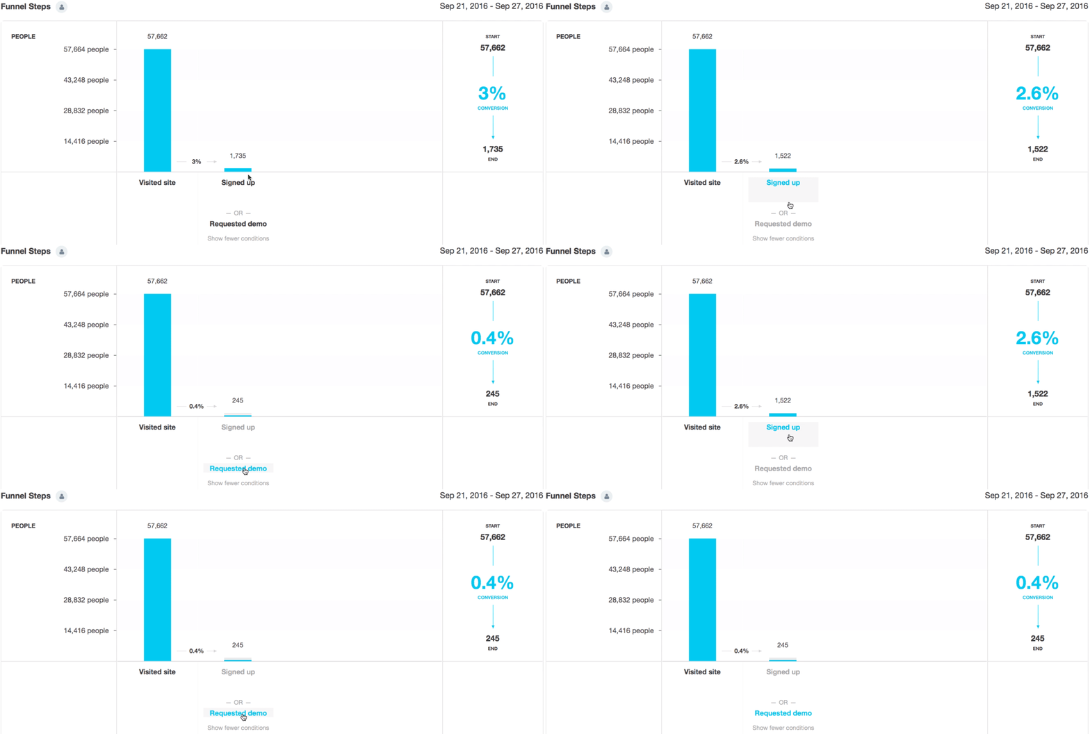
You can click between the two to get individual results, helping you figure out which path, conversion point, or page is most effective at driving your goals.
Like with the mobile example earlier, you can identify the ‘opportunity cost’ associated with one underperforming page against the better one.
Just imagine if you funneled all those wasted visits from the low ‘Request Demo’ to the higher converting ‘Signed Up’ page.
That arms you with powerful insight into how your campaigns line-up against each other, but also which campaign tactics to repeat or improve in the next one.
3. Post ‘Conversion’ Events
So far so good.
We’ve gained better insight into how different marketing channels have contributed to driving conversions in one or two sources.
And we’ve been able to finally prepare and deliver a comprehensive campaign performance report that gives you the ability to compare-and-contrast results against other campaigns (and pinpoint areas of improvement for the next one).
But we still have a problem.
Many times a ‘conversion’ only means a lead. There’s still a TON of stuff that needs to happen before those leads become honest-to-God paying customers.
Which most, unfortunately, won’t.
The objective here is the same, whether we’re talking about good old-fashioned lead nurturing or app onboarding – increase engagement along ‘micro-conversions’ until that person’s ready to sign on the dotted line (or enter their billing info).
These little ‘micro-conversions’ are success milestones; the key interaction points that turn passing interest into devotion.
For example, watching a video.
Videos on a landing page can increase conversion rates by 80%. But the important part, is what happens after people watch a video.
For example, after watching a video:
- 64% of viewers are more likely to purchase the product
- 50% of executives look for more information
- 39% of executives call a vendor
Wanna increase sales? Turn more prospects into customers? Convert more trial-ers into buyers?
Get people to watch that damn video.
GA can show you general video views as an aggregate engagement metric.
But that information is useless if you can’t decipher what those visitor’s lead status is or if your specific prospects are viewing it or not.
Solve this by creating a Funnel Report and identifying those that HAVE NOT done the specific event you’re looking for:
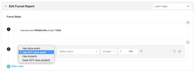
You can also get fancy and add different variables here (like we did in the last step); one for people who DID view, and those that DIDN’T.
Now you get the cold-hard data:
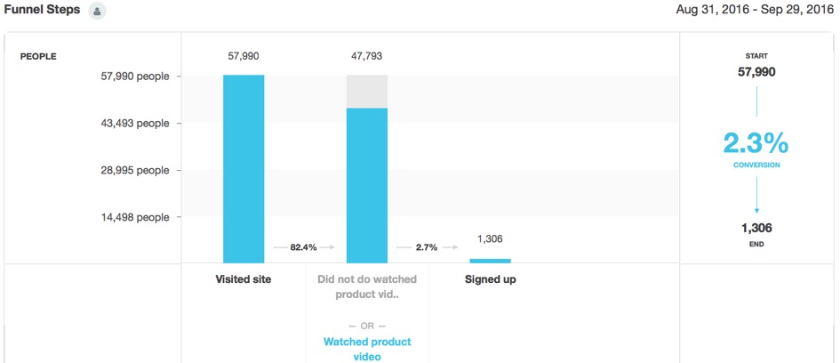
Now you can see (and prove), empirically with your own data, that people who view the video have higher sign-ups.
You can then also add more steps to this funnel to see if there is anything specific causing a bottleneck in your onboarding process, and/or identify whatever-it-is that’s holding back your leads from watching the video in the first place.
We’re using videos as an example in this case. But these variables for
source https://blog.kissmetrics.com/google-analytics-gaps/
No comments:
Post a Comment